Preview image. Unlock full-res
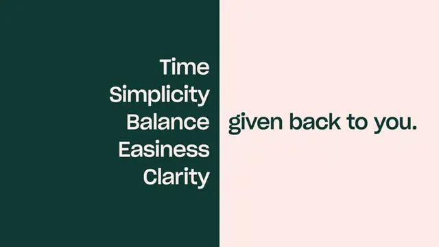
A brand statement split into a dark-green panel stacking five single-word benefits beside a blush panel completing the phrase 'given back to you.
Summary
A two-color split slide where a deep-green left panel stacks five right-aligned benefit words (Time, Simplicity, Balance, Easiness, Clarity) and a blush right panel finishes the sentence with 'given back to you.'
Visual description
The frame is divided vertically into a tall dark forest-green block on the left and a pale blush-pink field on the right. In the green block, five words sit in a centered-to-right white stack, one per line, in a rounded geometric sans. The phrase resolves across the seam: the pink side carries the green-colored payoff line 'given back to you.' aligned to the panel's vertical midline. The two colors are near-complementary in feel, giving high legibility with no imagery, icons, or rules.
Key takeaway
Break a single sentence across two contrasting color fields so the reader's eye crosses the seam to complete the thought. Stacking the abstract nouns vertically and the verb phrase horizontally makes a list double as a headline.
Reuse notes
Good for a values slide, an about section, or a social carousel cover where you want copy to carry the design with zero illustration. The completing-phrase trick needs a sentence that splits cleanly into a list plus a resolution. Pick two colors with enough contrast that the same text color reads on both.
More like this



Keep what you find
A free account saves references to boards and can send you a weekly email of picks based on what you save.
To see every result, go Pro.