Preview image. Unlock full-res
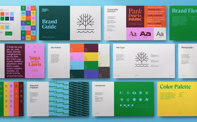
A 3x3 grid of brand-system pages showcasing logo, typography, color palette, and layout guidelines in muted green, yellow, and white.
Summary
A 3x3 grid of brand-system pages showcasing logo, typography, color palette, and layout guidelines in muted green, yellow, and white.
Visual description
A modular grid layout arranging 9 pages on a light blue background. Each page demonstrates a different aspect of the brand system: logo mark with geometric lines, "Brand Guide" cover in deep green, typography specimen with serif-to-sans hierarchy, "Our Palette" color-blocking in pink/yellow/purple/green sections, "Our Logo" usage page, "Photographer" guidelines with a single serif glyph, "Park" orange cover with oversized type, "Brand Elements" guideline page in bright green, and a final yellow "Color Palette" reference. All pages use generous whitespace and clean sans-serif headings, creating a unified, breathable rhythm. Color accents are restrained: forest green, warm mustard yellow, teal, soft purple, and charcoal gray. The overall impression is organized, calm, and nature-informed.
Key takeaway
The 9-panel grid format itself as a compact presentation of a complete identity system. The discipline of one dominant color plus one accent per page. The balance between solid geometry (the logo mark, color blocks) and typography in establishing visual harmony.
Reuse notes
Strong reference for a brand-guidelines publication or a pitch deck showing systems thinking. Works well in 16:9 presentations or print materials. The color palette and green-forward aesthetic suit natural products, consulting, or lifestyle brands. Avoid if the client needs a more corporate or austere treatment.
More like this


Keep what you find
A free account saves references to boards and can send you a weekly email of picks based on what you save.
To see every result, go Pro.