Preview image. Unlock full-res
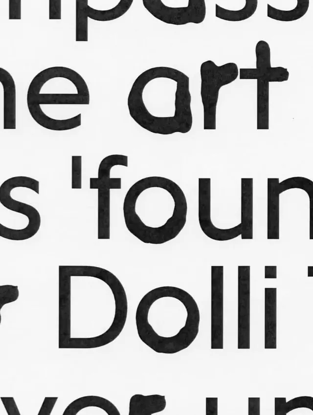
Extreme crop of stacked rounded-sans body text printed black on off-white, where ink bleed roughens the letter edges into a tactile, risograph-like texture.
Summary
A tight crop of large rounded sans-serif text where heavy ink bleed has eaten into the letter edges, turning clean type into a rough, printed texture.
Visual description
The frame is cut so close that only word fragments survive: "pass", "e art", "s 'foun", "Dolli". Type is a soft rounded-terminal sans in solid black on a warm off-white stock. Letters are stacked in left-aligned lines that bleed off all four edges, with no full word visible. The defining detail is the printing: edges are uneven and pocked, counters in the o and a fill unevenly, and the strokes show the mottled, slightly blotted quality of risograph or letterpress ink rather than crisp digital vectors.
Key takeaway
Crop a wordmark or headline hard enough that legibility breaks and the letterforms read as texture instead of words. Pair a friendly rounded sans with a heavy, imperfect ink treatment so the warmth of the shapes fights the grit of the print.
Reuse notes
Good as a section divider, cover texture, or zoomed brand detail where you want craft and tactility over a readable message. Avoid where the text actually needs to be read; the bleed and crop kill legibility by design.
More like this





Keep what you find
A free account saves references to boards and can send you a weekly email of picks based on what you save.
To see every result, go Pro.