Preview image. Unlock full-res
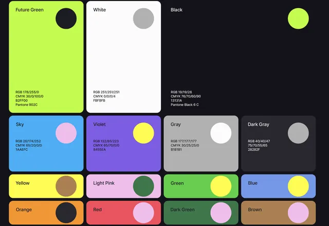
A brand color-palette board on near-black, with three large named cards carrying full RGB/CMYK/HEX/Pantone specs above a tighter grid of secondary swatches, each card pairing a fill with a contrasting accent dot.
Summary
A brand color-system page on a near-black ground: three hero swatch cards (Future Green, White, Black) each list RGB, CMYK, HEX and Pantone, sitting above two rows of smaller named secondary swatches.
Visual description
The board is organized in a clear hierarchy on a #131319 background. The top band holds three tall rounded cards, lime "Future Green", "White" and "Black", each labeled top-left and annotated with full color values (RGB 178/255/0, CMYK, HEX B2FF00, Pantone 902C, and so on). A middle band of four mid-size cards (Sky, Violet, Gray, Dark Gray) repeats the spec treatment, then a bottom band packs eight compact chips (Yellow, Light Pink, Green, Blue, Orange, Red, Dark Green, Brown). Every card carries a circular accent dot in a deliberately clashing partner color (lime on black, pink on green, yellow on blue), so the board doubles as a pairing guide rather than a flat list.
Key takeaway
Give primary brand colors large cards with complete cross-medium specs (RGB, CMYK, HEX, Pantone) and demote secondaries to a denser grid, so the page communicates importance through size. The contrasting accent dot inside each swatch is a neat trick for showing approved on-color combinations at a glance.
Reuse notes
A ready template for the color page of a brand guideline or a design-token reference. The dark canvas makes saturated swatches read accurately; on white you would lose the black and dark-gray cards. Pair with type and logo-usage pages built on the same card grid for a consistent system.
More like this


Keep what you find
A free account saves references to boards and can send you a weekly email of picks based on what you save.
To see every result, go Pro.