Preview image. Unlock full-res
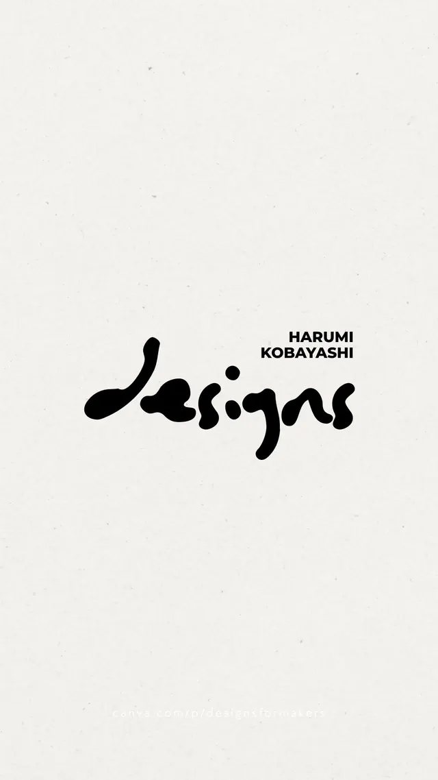
Organic flowing script wordmark for designer Harumi Kobayashi, paired with restrained uppercase name credit on cream linen background.
Summary
Hand-drawn organic script wordmark for Harumi Kobayashi, featuring a fluid, calligraphic mark above restrained uppercase letterpress-style name text, centered on textured cream stock.
Visual description
A centered composition with a dominant organic script in black ink above the typeset surname in small caps. The script is loose and fluid, composed of rounded letterforms with connecting flourishes that suggest movement and handcraft. The name credit sits far above in justified sans-serif, leaving ample negative space. The background is a warm cream or off-white with visible paper texture and aging marks (foxing or speckles), suggesting printed stationery or archival paper. High contrast between the pure black marks and the aged cream ground.
Key takeaway
The balance of precision and fluidity: the script remains expressive and organic while the name is crisp and modern sans-serif. The restraint of the composition creates breathing room that amplifies the elegance of the letterforms. Using visible paper texture and aging as part of the branding aesthetic.
Reuse notes
Perfect for independent designers, artists, and creative practitioners. Works best when the script is hand-drawn and authentic to the brand's identity. The cream substrate is key to the sophistication and would read as cold or generic on pure white. Not ideal for digital-only contexts; best applied to print collateral where the material matters.
More like this

Keep what you find
A free account saves references to boards and can send you a weekly email of picks based on what you save.
To see every result, go Pro.