Preview image. Unlock full-res
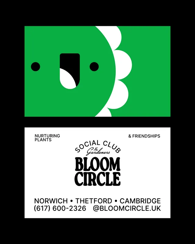
A two-sided business card for Bloom Circle gardeners: a bright-green sunflower-face mascot cropped on the front, a playful retro wordmark and contact details on the back.
Summary
A two-sided business card for Bloom Circle, a gardeners' social club, featuring a playful green sunflower-face mascot with petals cropped off-edge, paired with a chunky retro display wordmark and contact information.
Visual description
Two card mockups float on black. The top card is solid bright green: a simple face with two black dot eyes and a tall rounded black nose topped by a white scoop, sprouting white scalloped petals arranged like a sunflower fan, cropped sharply at the right edge so only the face and partial petals are visible. The bottom card is white: above the main wordmark sits a small arched "SOCIAL CLUB" label with a cursive "For Gardeners" script underneath; "BLOOM CIRCLE" dominates in a heavy rounded retro display typeface; "NURTURING PLANTS" and "& FRIENDSHIPS" anchor the top corners as a split tagline; below sits a city list (NORWICH, THETFORD, CAMBRIDGE) with phone and handle (@bloomcircle.uk). All text is black on white except the green card.
Key takeaway
Cropping the mascot so petals bleed off the edge transforms a small card into a fragment of a larger character, adding energy and perceived scale. Pairing a small cursive script accent above a bold rounded-retro logotype creates warmth and handcraft without needing a second color. Splitting the tagline into opposite top corners frames the mark and uses edge real estate efficiently.
Reuse notes
Strong identity template for nonprofits, community groups, or grassroots consumer brands wanting to feel approachable and locally made. The three-color system (black, white, one vibrant hue) keeps print production simple and reproducible. The retro rounded typeface carries the charm, so select it deliberately; a neutral sans would lose the personality entirely.
More like this



Keep what you find
A free account saves references to boards and can send you a weekly email of picks based on what you save.
To see every result, go Pro.