Preview image. Unlock full-res
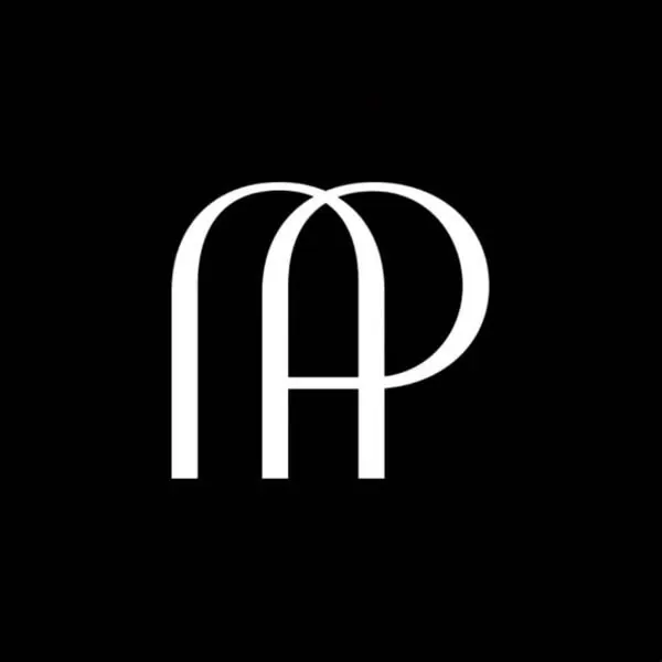
An AP monogram rendered in thick, continuous stroke weight, with interlocking curved and straight geometry against a black background.
Summary
A two-letter monogram combining A and P into a unified geometric symbol using thick outline strokes, with the letters interlocking through carefully balanced negative space and continuous line weight.
Visual description
Two capital letters (A and P) merge into a single mark via interlocking geometry. Both letters are rendered in thick white outlines with consistent stroke width, set against pure black. The A is upright with two curved arms that sweep open; the P sits to the right, its bowl wrapping around the upper-right curve of the A's stroke. The overall shape is symmetrical and self-contained, with active negative space between the letterforms creating visual rhythm.
Key takeaway
The interlocking technique avoids floating letterforms by making the strokes physically touch and cross. The thick outline weight gives the mark gravitas and legibility at any scale. The black background isolates the white form for maximum contrast and brand presence.
Reuse notes
Ideal for luxury, fashion, or professional services where a contemporary monogram is needed. Works at any size due to the bold stroke weight and optical clarity. Requires confident, high-contrast applications; loses impact on busy or mid-tone backgrounds.
More like this
Keep what you find
A free account saves references to boards and can send you a weekly email of picks based on what you save.
To see every result, go Pro.