Preview image. Unlock full-res
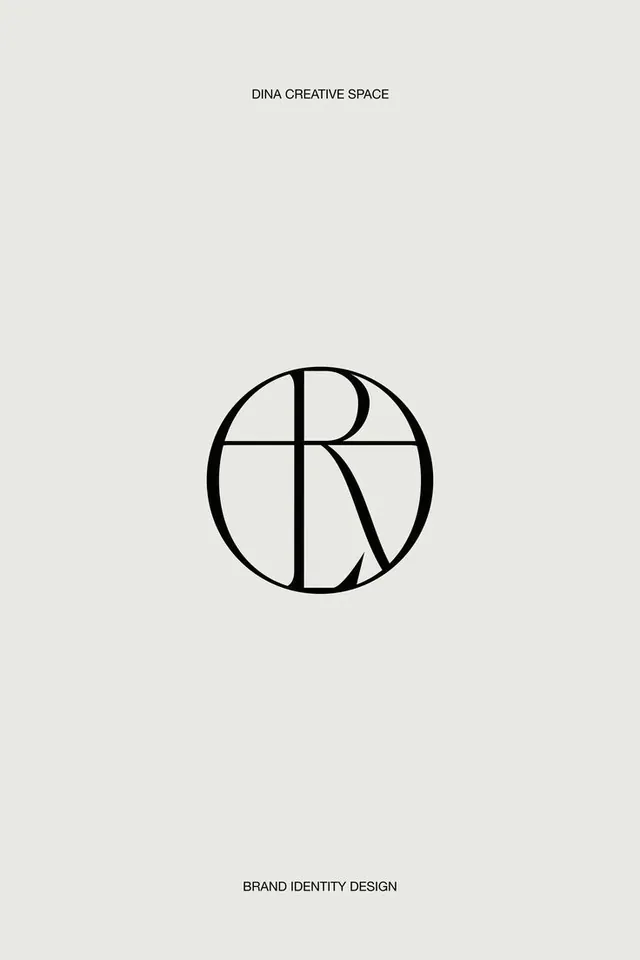
A centered circular monogram with the letter R subdivided by clean linear segments, anchored by complementary text labels above and below.
Summary
A centered circular monogram with the letter R subdivided by clean linear segments, anchored by complementary text labels above and below.
Visual description
A single capital R sits centered within a circle, divided into geometric quadrants by a vertical and horizontal axis. The letterform and dividing lines are rendered in uniform black strokes against a warm off-white background. Above the mark, "DINA CREATIVE SPACE" is set in a tight, modern sans-serif. Below, "BRAND IDENTITY DESIGN" appears in the same typeface at a smaller size, creating a two-tier text hierarchy. The circle acts as a containing boundary, giving the mark a badge-like, self-contained quality. All typography employs generous breathing room; the layout feels spacious and considered.
Key takeaway
The geometric grid inside a circular boundary creates a sophisticated, contemporary monogram that feels both modern and timeless. The circular boundary itself becomes part of the mark's identity, not merely a decorative frame. Using the same geometric divisions as structural elements (not gratuitous embellishment) ensures the design does not feel over-designed. The restrained color palette and ample white space convey luxury without relying on gradients or effects.
Reuse notes
A strong model for design studios, creative agencies, or personal brands seeking sophisticated mark. Works beautifully scaled up on signage or stationery, and scales down cleanly to app icons and favicons. The geometric system is flexible: the R can be replaced with another letter, or the divisions adjusted, without losing the identity's DNA. Pair with modern sans-serifs in the wider brand system for cohesion.
More like this



Keep what you find
A free account saves references to boards and can send you a weekly email of picks based on what you save.
To see every result, go Pro.