Preview image. Unlock full-res
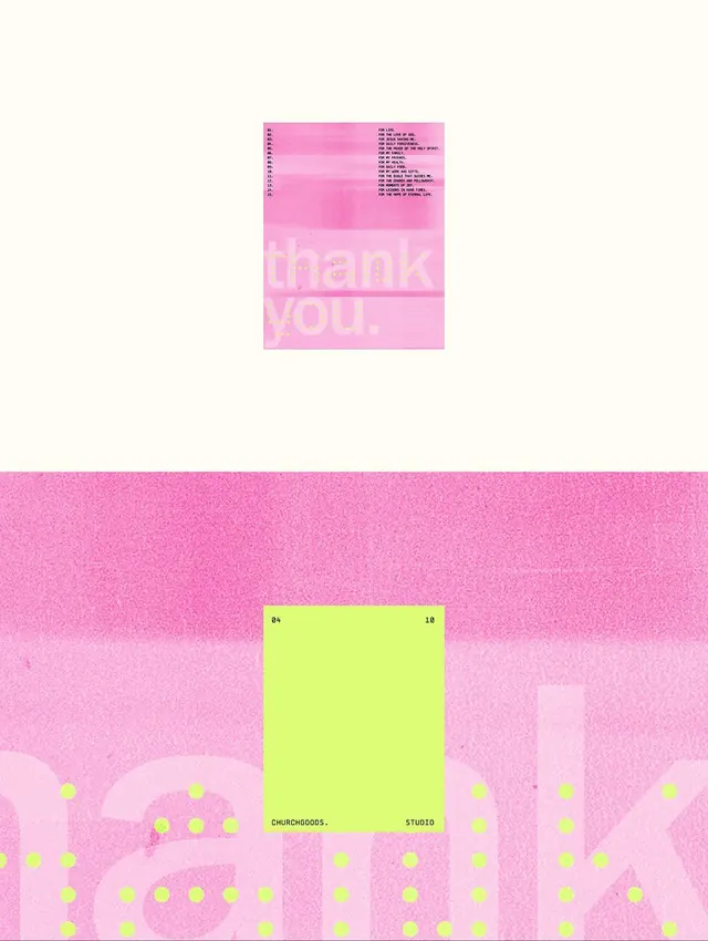
A small grainy pink thank-you poster numbered list shown above an extreme crop of the same layout, with a lime sample square reading 04 / 10 and CHURCHGOODS. STUDIO.
Summary
A two-up presentation: a small grainy pink poster set on cream up top, and a tight zoom of the same poster below. The poster pairs a two-column numbered list of short lines with the words thank you. set huge in tonal pink.
Visual description
Top: a portrait poster floating centered on a pale cream field. Its ground is a textured, risograph-grainy pink. A small two-column block at the top lists numbered items (01 through about 15) in tiny monospaced caps, left labels and right phrases. Below it, thank you. is set very large in a heavy sans, in a slightly lighter pink so it reads as tonal rather than contrasting. Bottom: an extreme crop of the same artwork, now filling the frame, where the giant pink letters become abstract shapes and a scatter of lime polka dots emerges over them. Laid on top is a flat lime-green rectangle ruled 04 top-left, 10 top-right, with CHURCHGOODS. and STUDIO along its bottom edge, framed like a swatch or page marker.
Key takeaway
Tone-on-tone display type: setting the hero word only a shade off the background turns it into quiet texture instead of a shout, while the tiny monospaced list does the actual reading. And the swatch overlay (04 / 10 plus studio credit on a contrasting lime block) is a tidy way to brand and paginate a series.
Reuse notes
Good for a gratitude card, zine, or studio collateral that wants warmth and craft over corporate polish. The grain and tonal type read as printed, not digital, so it suits riso and packaging. Caveat: the low-contrast pink-on-pink is intentionally hard to read, keep critical information in the high-contrast lime block, not the tonal type.
More like this
Keep what you find
A free account saves references to boards and can send you a weekly email of picks based on what you save.
To see every result, go Pro.