Preview image. Unlock full-res
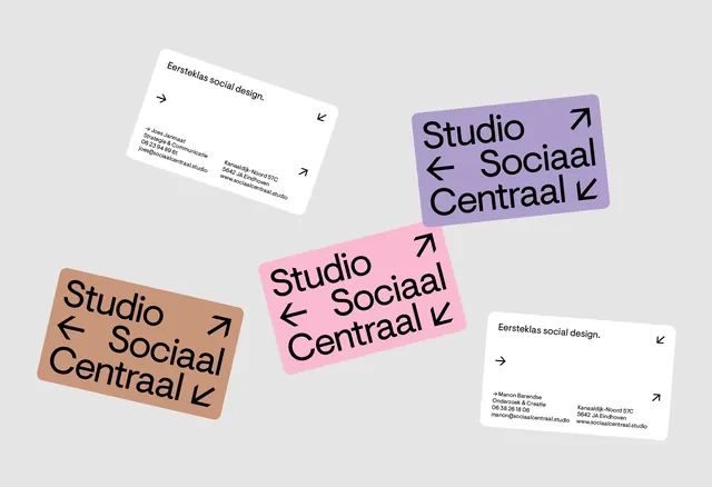
Minimalist business cards in pastel hues (white, pink, mauve, tan) with simple directional arrows and sans-serif text, scattered across light gray.
Summary
Minimalist business cards in pastel hues (white, pink, mauve, tan) with simple directional arrows and sans-serif text, scattered across light gray.
Visual description
Five business cards are arranged casually on a light gray background. Three cards display the same design in different colors: one white, one soft pink, one mauve. Each features the text "Studio Sociaal Centraal" in black sans-serif, with small directional arrows (left, right, up, down) at the corners. Two plain white cards with minimal text and contact information sit apart. The layout is loose and organic, suggesting a system that works across multiple color variations. All typography is clean, sans-serif, and tightly kerned.
Key takeaway
The directional arrow system as a visual motif that suggests connection, flexibility, and movement. The pastel color blocking makes identical cards feel distinct and playful. The scattered arrangement implies a cohesive system without heavy hierarchy. Minimal information density on the cards keeps them refined and memorable.
Reuse notes
Ideal for design studios, creative consultancies, and multidisciplinary agencies wanting personality without ornamentation. The arrow system works well for brands emphasizing connection or multiple service areas. The color variations show how a single design can feel fresh across a palette.
More like this


Keep what you find
A free account saves references to boards and can send you a weekly email of picks based on what you save.
To see every result, go Pro.