Preview image. Unlock full-res
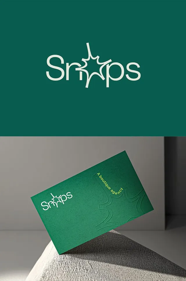
A boutique-agency identity pairing an off-white script-ish wordmark with a starburst glyph over deep green, shown as a logo lockup and an embossed business card.
Summary
An identity for a boutique agency that swaps the middle letters of its off-white wordmark for a hand-drawn starburst glyph, presented over deep forest green as both a flat lockup and a floating embossed business card.
Visual description
The top half is a solid dark-green field holding a single off-white wordmark in a rounded humanist sans, where a spiky starburst or burst-flower mark stands in for the central characters, fusing icon and type. The bottom half is a photographic mockup: a green business card tilts on a textured pale surface, lit to throw a soft diagonal shadow. The card repeats the wordmark small in the upper-left, sets "A boutique agency" in thin vertical type running up the right edge, and blind-embosses an oversized version of the starburst into the card stock so it reads only as a tonal relief.
Key takeaway
Replacing letters in a wordmark with a single emblem so the logo and symbol are one inseparable mark. Blind-embossing that same emblem large on the card adds tactile interest while keeping the print one color. A near-monochrome green palette across logo and collateral feels considered and premium.
Reuse notes
Strong template for a small creative studio or boutique service brand presenting itself as understated and high-end. The embossed mockup sells craft, so it pairs well with uncoated or colored stock. The letter-swap glyph must stay legible, so test that the wordmark still reads at small sizes without color help.
More like this

Keep what you find
A free account saves references to boards and can send you a weekly email of picks based on what you save.
To see every result, go Pro.