Preview image. Unlock full-res
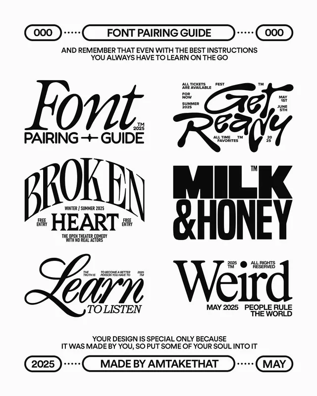
A black-on-cream typographic poster titled Font Pairing Guide that showcases six display lettering treatments, from swash script to bold grotesque, framed by pill-shaped header and footer labels.
Summary
A vertical lettering poster that demonstrates six contrasting display treatments as a "Font Pairing Guide," all in black on a cream ground.
Visual description
Pill-shaped capsule labels bookend the layout: "FONT PAIRING GUIDE" flanked by "000" markers at the top, "MADE BY AMTAKETHAT" with "2025" and "MAY" at the bottom, each linked by dotted-line connectors. Between them sit six lettering compositions in a two-column arrangement: a flourished italic "Font Pairing + Guide," a liquid bubble script "Get Ready" surrounded by tiny event-tag captions, a curved condensed serif "BROKEN HEART," a heavy black grotesque "MILK & HONEY," a fine retro script "Learn to Listen," and a high-contrast serif "Weird." Small all-caps annotations and trademark and registration marks scatter around each piece as faux metadata.
Key takeaway
The capsule labels with dotted-line tails as a header and footer system, and the trick of surrounding each hero word with tiny all-caps tags (dates, "all rights reserved," "free entry") to add density and a ticketed, editorial feel. Six wildly different letterforms held together by one black-on-cream palette.
Reuse notes
Reach for this when presenting a type or lettering range, a music or event identity, or a streetwear brand sheet. The peripheral micro-captions are the move worth borrowing for any layout that feels too empty. Strictly two-tone, so it leans on letterform variety rather than color.
More like this



Keep what you find
A free account saves references to boards and can send you a weekly email of picks based on what you save.
To see every result, go Pro.