Preview image. Unlock full-res
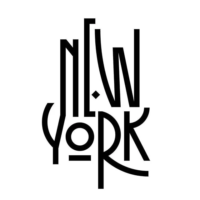
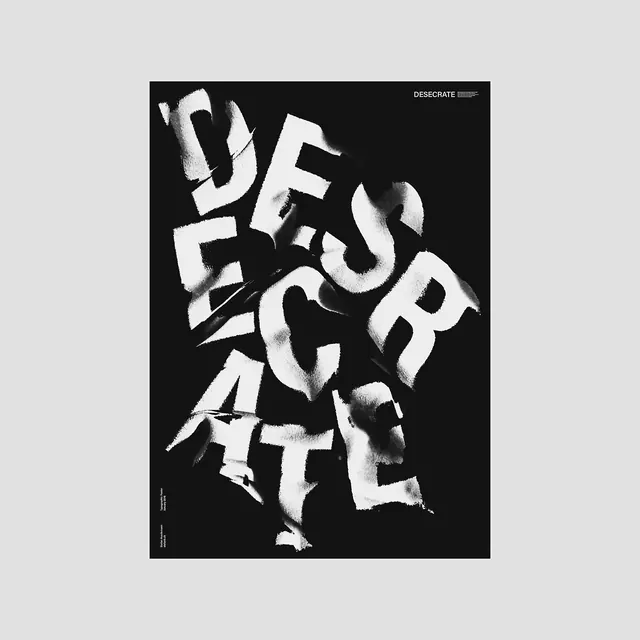
Heavily distorted artistic letterforms arranged in a stacked composition with ambiguous readability, exploring experimental type design.

Summary
A heavily distorted typographic composition with artistic letterforms that prioritize visual expression over legibility. The letterforms are stacked vertically with complex overlaps and warped proportions.
Visual description
Black letterforms on white background arranged in a layered, stacked composition. The characters are severely distorted with variable widths, curved lines, and extreme skewing that makes the text difficult to read clearly. Some forms suggest letters while others dissolve into pure abstract shapes. A small diamond punctuation mark sits near the center. The overall effect is a visual exploration of how far typography can be pushed while maintaining compositional balance.
Key takeaway
When the art of the distortion becomes more important than legibility. The design shows how breaking formal type rules can create visually striking results that prioritize emotional impact over communication clarity.
Reuse notes
Useful for editorial designs, album covers, or artistic posters where the visual impact of broken typography is the point. Works as a conceptual statement rather than functional typographic communication. Best used sparingly and in contexts where illegibility is intentional and acceptable.
More like this

Keep what you find
A free account saves references to boards and can send you a weekly email of picks based on what you save.
To see every result, go Pro.