Preview image. Unlock full-res
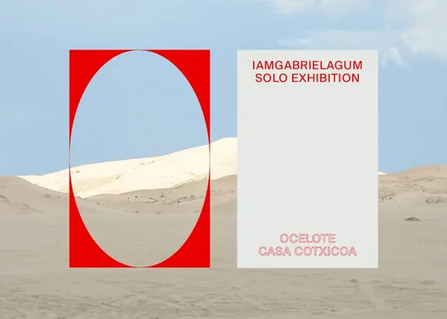
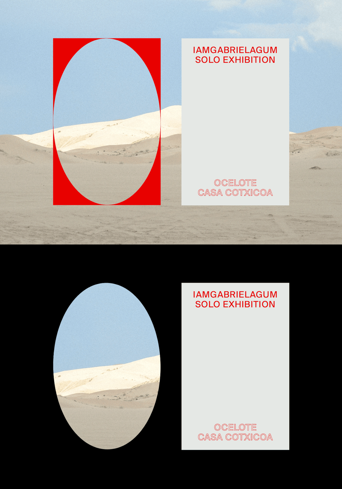
Exhibition identity placing a red panel with an oval cut-out and a gray poster titled IAMGABRIELAGUM SOLO EXHIBITION over a pale desert-dune photograph.
Summary
An exhibition identity that turns a red panel into a letter: a tall oval is knocked out of the red block so the desert behind shows through, forming the "O" of OCELOTE.
Visual description
The full-bleed background is a photograph of pale sand dunes under a hazy blue sky. Two upright panels sit centered. The left panel is a saturated red rectangle with a large vertical oval cut out of it, the dune landscape filling the void. The right panel is a flat light-gray poster: top-left, red all-caps "IAMGABRIELAGUM / SOLO EXHIBITION" in a plain sans, and bottom-center "OCELOTE / CASA COTXICOA" set in red outline (hollow) caps. The whole thing reads as a poster mockup floating over its environment.
Key takeaway
Cut a logotype letter straight out of a color block so the background image becomes part of the mark. The single oval doing double duty as both a shape and the "O" is the whole idea. Pairing solid-fill display type with the same words in outline weight gives hierarchy without a second color or font.
Reuse notes
Good reference for art-show, gallery, and cultural-event branding where you want one bold mark that flexes across posters, invites, and social. The cut-out trick relies on a strong, texturally interesting background photo; over a flat or busy image it loses the effect.