Preview image. Unlock full-res
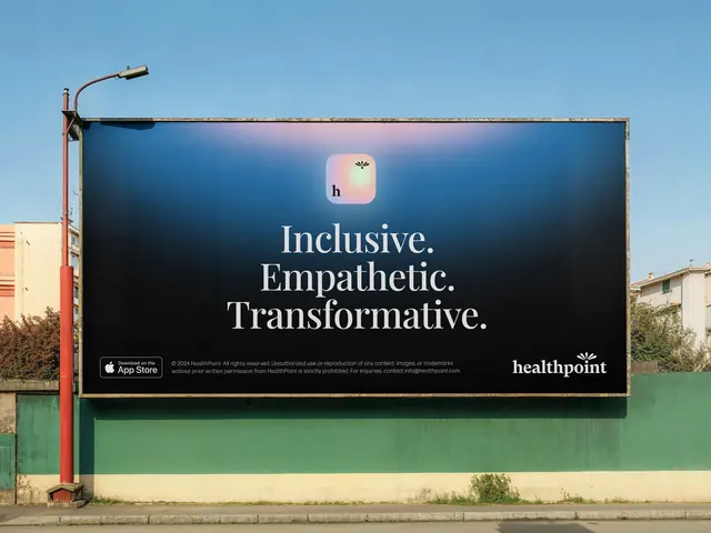
A roadside billboard for a healthcare app with navy field, iridescent icon, and three stacked one-word lines each punctuated: Inclusive. Empathetic. Transformative.
Summary
A photographic billboard mockup mounted on a real roadside hoarding showing a healthcare app ad with a dark navy field, centered iridescent icon, and three stacked white-type value statements punctuated with periods.
Visual description
The shot frames a large billboard attached to an outdoor hoarding above a teal-green wall beneath a clear sky; a street lamp arcs overhead. The ad field is navy-to-near-black with a faint warm radial glow at upper right. At center top sits a small rounded-square app icon with soft pearlescent gradient (pink-blue-green shift) and lowercase "h" mark. Below in clean white sans-serif, three words stack as separate lines, each ending with a period: "Inclusive." "Empathetic." "Transformative." Bottom left holds an App Store badge and legal copy; bottom right displays the "healthpoint" wordmark with a small leaf icon.
Key takeaway
The one-word-per-line stacked headline with terminal periods turns a brand promise list into a confident, rhythmic statement readable at distance. A single iridescent app icon against dark navy creates visual focus without clutter. The layout scales from billboard to web without change.
Reuse notes
Strong template for app or service campaigns where brand values are core messaging. The stacked-period pattern works equally well on web hero sections and social cards. Keep headlines short for readability at distance. The photographic mockup context is optional; the ad layout itself is the reusable asset.
More like this

Keep what you find
A free account saves references to boards and can send you a weekly email of picks based on what you save.
To see every result, go Pro.