Preview image. Unlock full-res
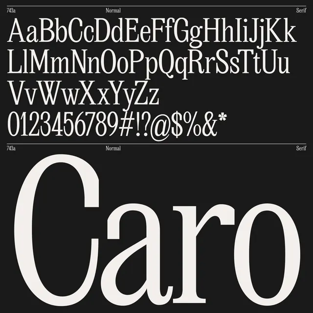
A type-specimen layout with a complete character set displayed in clean sans-serif above, and the word Caro rendered in an elegant high-contrast serif display face below.
Summary
A type-specimen layout with a complete character set displayed in clean sans-serif above, and the word Caro rendered in an elegant high-contrast serif display face below.
Visual description
The composition is split into two zones: a reference section at the top showing every uppercase and lowercase letter (A-Z, a-z), numerals (0-9), and special punctuation (@, #, $, %, &, *, !, ?) in a tight, uniform sans-serif; below that, a dashed line separator, then rows of slash marks in a reduced, decorative pattern that fades toward the bottom. The lower half is dominated by the single word Caro in a serif typeface with pronounced thick-and-thin contrast, set in a large display size. Black text throughout on a light cream-gray background.
Key takeaway
The two-tier layout (reference → display) clearly separates functional character inventory from stylistic showcase. The decorative slash pattern is a clever spacer that references the typeface's internal geometry without competing. The monochrome palette and ample negative space communicate refinement and precision.
Reuse notes
A strong template for font-family specimens, brand typography guides, or editorial type features. Works best when you want to show both the range and the personality of a typeface. The clean sans reference at top makes the serif display pop; flip this structure for different type pairings.
More like this





Keep what you find
A free account saves references to boards and can send you a weekly email of picks based on what you save.
To see every result, go Pro.