Preview image. Unlock full-res
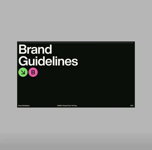
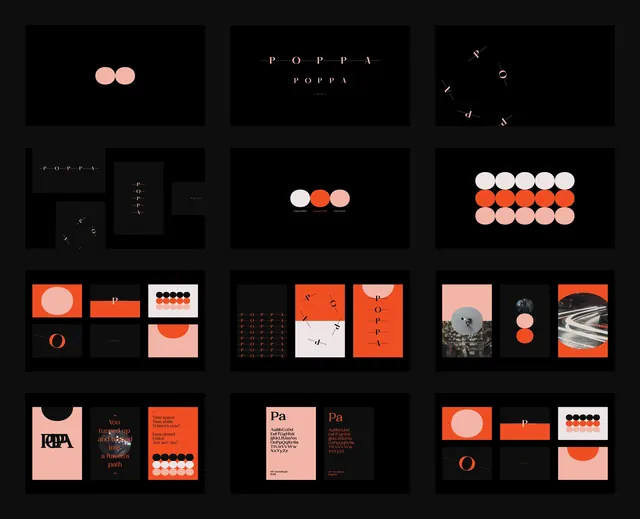
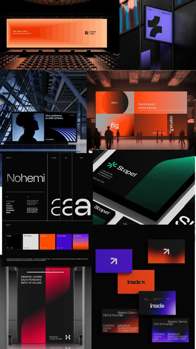
Comprehensive visual identity system featuring multiple logo applications across signage, packaging, digital, and architectural touchpoints unified by dark backgrounds and neon-bright geometric accents.
Summary
A wide-format brand identity showcase displaying logos, environmental graphics, digital interfaces, and collateral applied consistently across pitch-black and near-black backgrounds with electric orange, blue, purple, and teal geometric accents.
Visual description
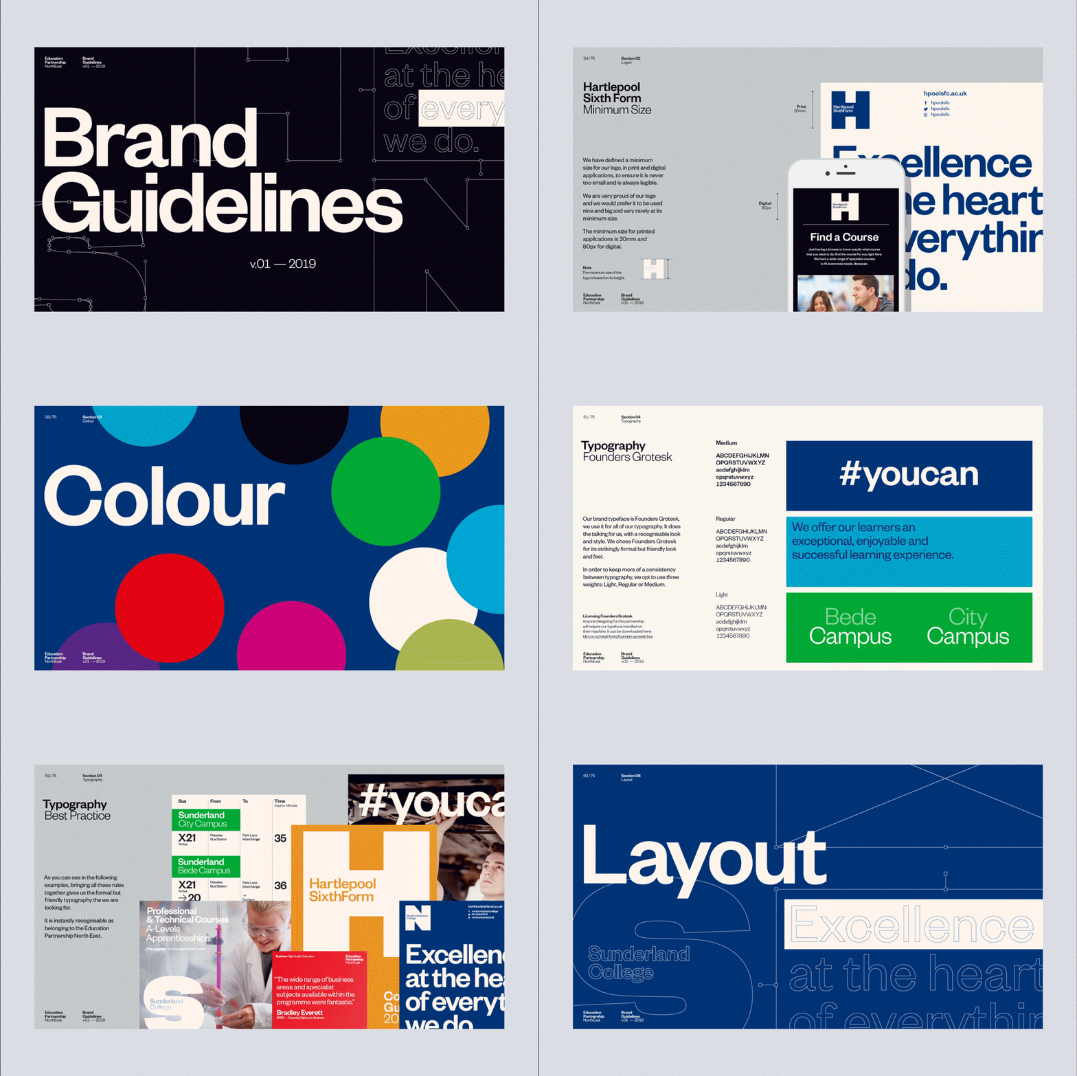
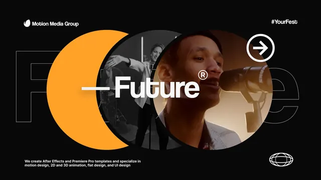
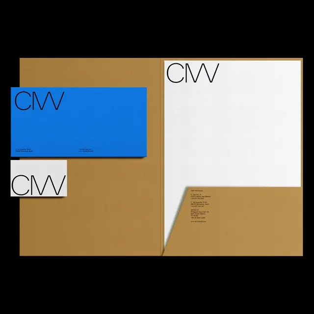
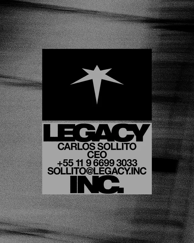
A dense multi-panel collage (roughly 3x4 grid) capturing various applications of a unified identity system. Top row shows signage in illuminated orange against dark building exteriors and a purple-screened digital installation. Middle section includes packaging (tall dark box with red color block), what appears to be a business card or invitation on emerald green, and a color palette swatch showing whites, oranges, purples, and teals. Lower panels feature further digital applications, branded promotional materials with sans-serif typography, and geometric color studies in reds, blues, and magentas. All layouts exploit high contrast between saturated accent colors and deep near-black fields.
Key takeaway
The color strategy of using three to four bright, complementary accent colors (orange, teal, purple, lime) against near-black to create drama and energy; the consistent geometric mark applied to multiple touchpoints; the approach to environmental graphics using large-scale illumination for wayfinding and impact.
Reuse notes
Ideal reference for agencies, tech companies, and cultural institutions seeking a premium dark-mode identity. Works especially well for architecture, design, or innovation-focused brands. The high contrast ensures legibility indoors and outdoors. Requires high production quality to execute at signage and display scale.