Preview image. Unlock full-res
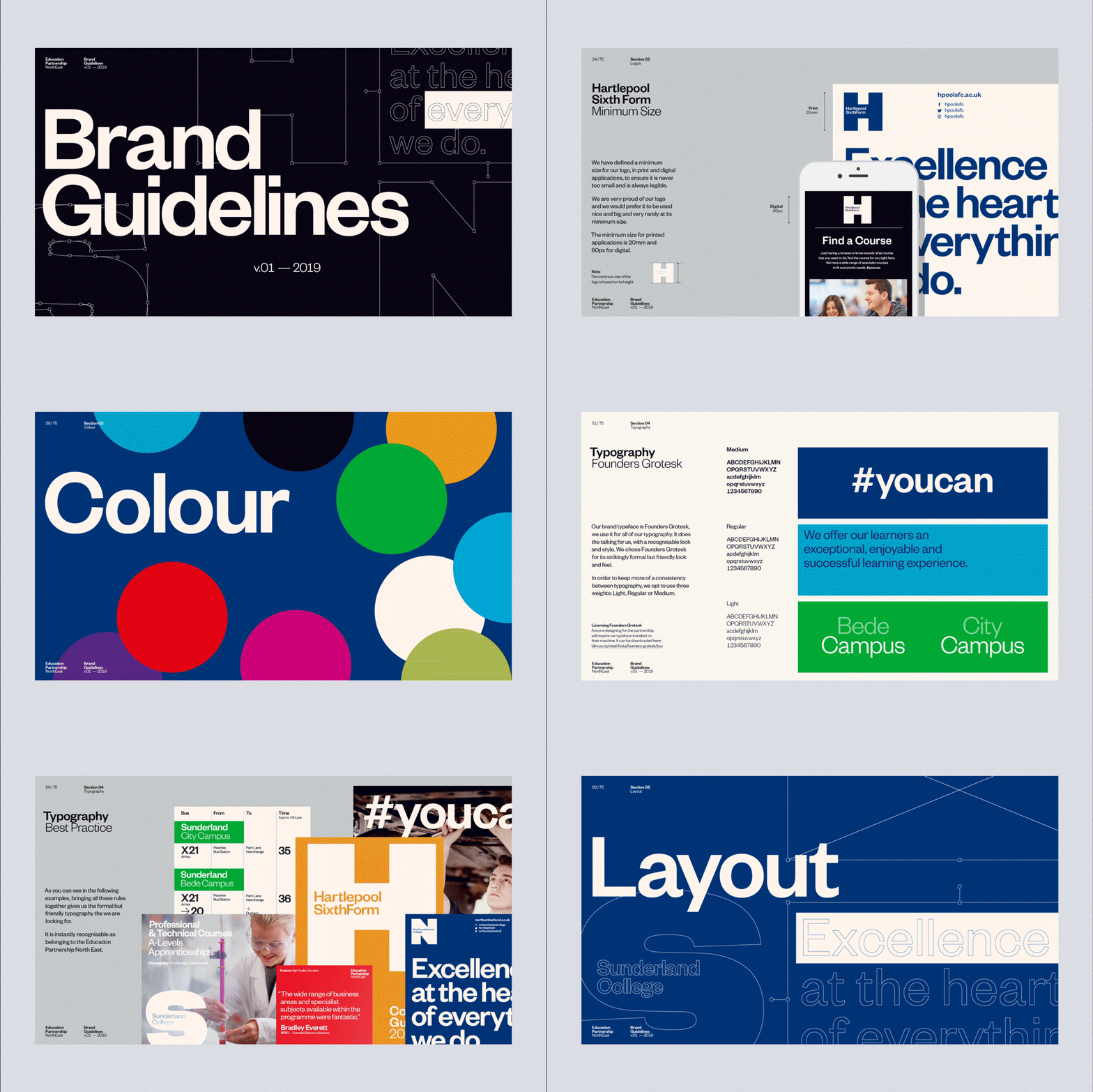
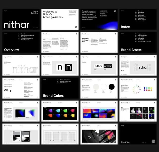
A brand guidelines cover with bold white sans-serif wordmark against dark navy background, subtle geometric grid lines, and small secondary text in the upper right.
Summary
A brand guidelines cover with bold white sans-serif wordmark against dark navy background, subtle geometric grid lines, and small secondary text in the upper right.
Visual description
Dark navy field with faint light-gray geometric lines suggesting a grid or structural system. Large "Brand Guidelines" wordmark in bold, heavy white sans-serif aligned to the left side, occupying about a third of the composition. Small text in the upper left corner (possibly tagline or studio name) and right corner (metadata or version information). The geometric grid lines create visual rhythm without clutter, reinforcing a sense of order and system. Light-gray text in the upper right reads as both informational and compositional, balancing the dominant wordmark.
Key takeaway
The use of a dark background with high-contrast white type projects authority and premium positioning while remaining utterly minimal. The faint grid system adds sophistication and structure without visual noise. The asymmetrical layout (dominant left wordmark with small supporting text top-left and top-right) creates visual interest while maintaining clarity.
Reuse notes
Effective for corporate brands, design systems documentation, and professional-services identity guidelines. Works best when you want to convey seriousness and structure without decoration. The dark mode approach suits tech, finance, and luxury brands. Avoid this template if your brand is warm, playful, or designed for younger audiences.
More like this






Keep what you find
A free account saves references to boards and can send you a weekly email of picks based on what you save.
To see every result, go Pro.