Preview image. Unlock full-res
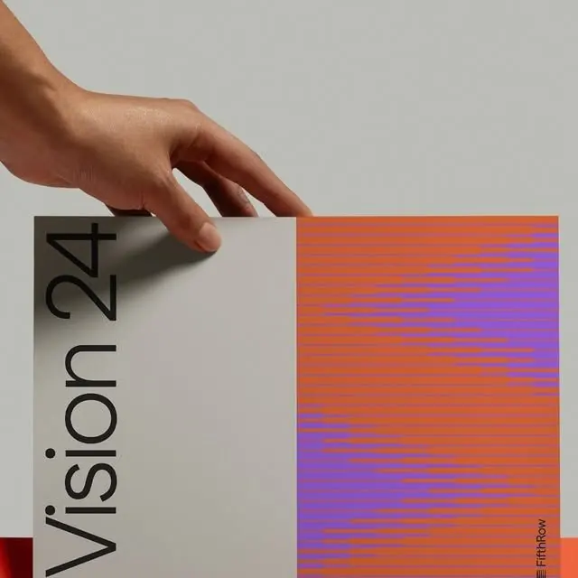
A business card mockup pairing clean sans-serif typography on muted gray with a textured gradient fill in warm orange and cool purple, creating a modular identity system.
Summary
A business card mockup pairing clean sans-serif typography on muted gray with a textured gradient fill in warm orange and cool purple, creating a modular identity system.
Visual description
A hand holds a business card at an angle. The left half is a warm light gray with the text "Vision 24" in a condensed sans-serif, reading vertically. The right half features horizontal striations transitioning from warm rusty orange at the top through saturated purple to deeper magenta at the bottom, creating movement. The striations suggest texture or screen printing rather than smooth fill. A small red accent appears at the bottom left corner. The overall composition demonstrates a split design approach where text and visual identity occupy separate halves of a card format.
Key takeaway
The split-format approach allows both typography and color to breathe independently. The gradient's striations add dimension without requiring imagery, and the warm-to-cool transition creates perceptual motion. The complementary orange-purple relationship is high-impact without feeling garish.
Reuse notes
Works for brands that want a bold, modern secondary mark or pattern. The horizontal striation device can be applied to other shapes, backgrounds, or assets. Consider this format for cards, covers, or dividers in print collateral.