Preview image. Unlock full-res
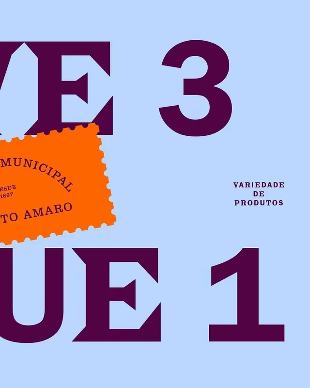
Large-scale geometric numerals and a bright orange postal stamp accent anchor a playful, high-contrast packaging design in plum and periwinkle.
Summary
Large-scale geometric numerals and a bright orange postal stamp accent anchor a playful, high-contrast packaging design in plum and periwinkle.
Visual description
Periwinkle background with four giant sans-serif numerals scattered asymmetrically: "E", "3" (top half), "UE", "1" (bottom half), all in deep plum. An orange rectangular stamp with scalloped edges and Portuguese text ("MUNICIPAL", "DESDE 1897", "TO AMARO") overlays the left side, colliding with the letterforms. Secondary sans-serif label text in plum ("VARIEDADE DE PRODUTOS") sits to the right at mid-height. The composition balances rigid geometry with the organic interruption of the stamp, using color contrast and scale alone for visual hierarchy.
Key takeaway
The collision technique: letting a decorative stamp or label physically overlap and interrupt large primary type rather than sit in a reserved zone. The specificity of the postal stamp as an authenticity marker. The fearless oversizing of numerals to create compositional weight while keeping supporting text small and unobtrusive.
Reuse notes
Strong for Portuguese or European consumer packaging, especially where authentic, regional, or artisanal messaging is part of the story. The plum-plus-orange palette skews warm and contemporary. The scalloped stamp edge adds personality without adding complexity. Less suitable for luxury or minimalist work where color contrast is meant to be restful rather than energetic.
More like this

Keep what you find
A free account saves references to boards and can send you a weekly email of picks based on what you save.
To see every result, go Pro.