Preview image. Unlock full-res
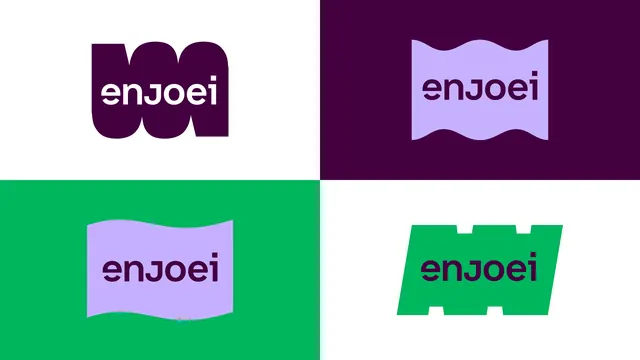
Four typographic logo variations of 'enjoei' in purple, bright green, and lavender, each nested in a complementary colored container with geometric curves and cutouts.
Summary
Four typographic explorations of the "enjoei" logotype, each placed in a geometric container using bold color contrast between dark purple, bright green, and soft lavender.
Visual description
A 2x2 grid showing the same typeface rendered in four distinct color-and-shape combinations. Top-left: white sans-serif text inside a rounded dark-purple blob. Top-right: dark purple text in a lavender wave-edged rectangle on dark purple. Bottom-left: dark purple text in a lavender wavy parallelogram on bright green. Bottom-right: dark purple text in a bright green parallelogram with crenellated top and bottom edges, on white. Each container emphasizes shape and chromatic contrast rather than ornament.
Key takeaway
The systematic exploration of a single typeface across isolated color pairings; the geometric containers (curves, waves, crenellations) give each variation a distinct personality while keeping type constant. The high-contrast color blocking (neon green against deep purple, soft lavender against either) is instantly recognizable.
Reuse notes
A working example of logo-system variation for e-commerce and retail brands. Useful when designing a flexible brand identity that plays with geometry and color without adding complexity to the letterforms. Works well for younger, energetic brands comfortable with bold, saturated color choices.
More like this
Keep what you find
A free account saves references to boards and can send you a weekly email of picks based on what you save.
To see every result, go Pro.