Preview image. Unlock full-res
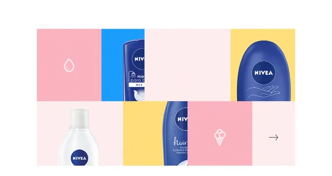
A color-blocked grid layout featuring NIVEA skincare bottles and jars with water droplet icons in pink, blue, and yellow sections.
Summary
NIVEA skincare products arranged in a color-blocked grid with bright pink, blue, and yellow sections, punctuated by minimalist water droplet and icon symbols.
Visual description
A horizontal grid of three rows and multiple columns filled with NIVEA product bottles and jars (milk, body lotion, hair shampoo) displayed against bold color blocks. Top row: pink section with a white water droplet icon, blue section with a NIVEA body cream bottle, and yellow section with a NIVEA jar. Bottom row: a white NIVEA lotion bottle on pale pink, yellow section with a NIVEA shampoo bottle, and a pink section with a white geometric ice cream icon. Each product is clearly visible with the NIVEA branding and product labels. The palette alternates between soft pink backgrounds and vibrant blue and yellow sections, creating strong visual contrast and organization.
Key takeaway
Color blocking creates visual rhythm and hierarchy while showcasing a diverse product range. The alternating solid color fields provide breathing room between products and emphasize the modular nature of the lineup. Minimal iconography (water droplets, geometric shapes) reinforces the brand system without cluttering.
Reuse notes
Effective for displaying a product family with multiple SKUs across different categories. Works well for retail presentations, e-commerce grids, or brand mood boards showing product ecosystem. The color blocking technique simplifies complex product photography and makes each item feel intentional and designed.
More like this


Keep what you find
A free account saves references to boards and can send you a weekly email of picks based on what you save.
To see every result, go Pro.