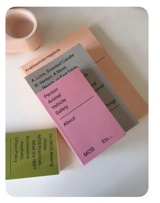
Preview image. Unlock full-res
A set of stationery cards with color-coded tabs organizing typography information, pairing warm neutrals with pink, green, and grey accent bands.
Summary
A minimalist type specimen system using stacked, color-tabbed cards to categorize and present typeface information in a warm, muted palette.
Visual description
Three rectangular cards are arranged at angles on a white background, each with a colored left-edge accent band: one soft pink, one olive-green, one warm grey-brown. The cards display text-heavy layouts listing typeface names, weights, and classification information in clean sans-serif. A ceramic mug in warm beige sits in the upper left, suggesting a print collateral context. The palette relies on warm neutrals (cream, taupe, khaki) paired with pastel accents, creating visual variety through color tabs rather than heavy typography or imagery.
Key takeaway
The color-coded tab system as a filing/organizational device on print materials; the restrained warm palette that feels both professional and approachable; the use of pastel accent colors (pink, green, grey) to break up neutrality without becoming vibrant.
Reuse notes
Strong for type foundries, design studios, or any branding system that needs to present multiple variants or categories on a single page. The tab metaphor works especially well for print collateral like specimen cards, rate cards, or service menus. The palette translates well to hospitality, design, or lifestyle brands seeking understated sophistication.
More like this

Keep what you find
A free account saves references to boards and can send you a weekly email of picks based on what you save.
To see every result, go Pro.