Preview image. Unlock full-res
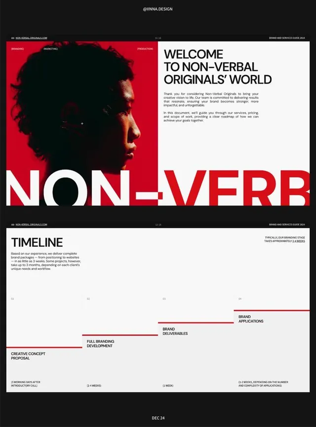
Non-Verbal Originals brand guide using a red and black asymmetrical split, large-scale type, portrait photography, and timeline diagrams to assert a confident, contemporary identity.
Summary
Non-Verbal Originals brand guide using a red and black asymmetrical split, large-scale type, portrait photography, and timeline diagrams to assert a confident, contemporary identity.
Visual description
The first spread splits vertically: a vivid red left half with a portrait silhouette in profile (dark/underlit against the red), and a white right half containing a bold headline in black sans-serif ("WELCOME TO NON-VERBAL ORIGINALS' WORLD") with smaller body copy and a service introduction. The wordmark "NON-VERB" in white capitals occupies the bottom edge, spanning both halves. Below, a white page with a left-aligned heading "TIMELINE" and a timeline chart: a series of horizontal bars representing project stages (Creative Concept, Full Branding, Brand Deliverables, Brand Applications) against a strict grid, with numbered phases (Q1–Q4) and duration notes. All text is uppercase or mixed-case sans-serif in black; the red is strictly compositional, never textured or distressed.
Key takeaway
The split-screen composition forcing a dramatic red/white contrast and asserting a single brand color at scale. The timeline diagram format: minimal line weights, numeric + text labels, no icons, creating a professional but avant-garde rhythm. The all-caps, geometric sans-serif lockup that reads as emblem.
Reuse notes
Strong for creative agencies, production studios, and brands with a single bold secondary color. The portrait silhouette is intimate but the red reads corporate; works for in-person pitch decks and printed brand guidelines. Avoid if the brand color is muted or pastels; this format demands saturation.
More like this





Keep what you find
A free account saves references to boards and can send you a weekly email of picks based on what you save.
To see every result, go Pro.