Preview image. Unlock full-res
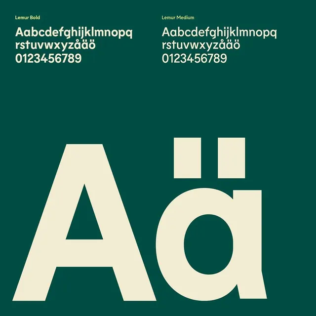
A type specimen showcasing Lemur Bold and Medium weights in cream against deep teal, demonstrating full character set including Nordic diacritics and numerals.
Summary
A type specimen for Lemur, comparing Bold and Medium weights with full character coverage including Nordic diacritics and numerals on a teal background.
Visual description
Two columns display the Lemur typeface at scale against a deep teal background, with cream text. The left column shows Lemur Bold, the right Medium, each with a complete alphabet, lowercase set with Nordic characters (including aa, oo with diacritics), and full numeral range 0-9. Below the text samples, large geometric letterforms demonstrate the font's proportions and weight contrast: a monumental sans-serif A with a triangular counter and a curved d with a full-height bowl and stem. A small horizontal rule separates type samples from specimen letters. The layout is strictly symmetrical, grid-based, with even spacing and no imagery.
Key takeaway
The side-by-side weight comparison is a clarity move for presenting multiple font cuts without clutter. The large specimen letters below anchor the typeface's character and make its geometric language memorable. The cream-on-teal palette offers high legibility while being understated enough not to overshadow the type itself.
Reuse notes
Essential reference for designing a type-specimen catalog, brand guidelines, or font marketplace listing. Works especially well when the typeface has strong geometric or display qualities. The Nordic diacritics signal a European or Scandinavian design sensibility; pair this pattern with any font supporting multiple language sets.
More like this




Keep what you find
A free account saves references to boards and can send you a weekly email of picks based on what you save.
To see every result, go Pro.