Preview image. Unlock full-res
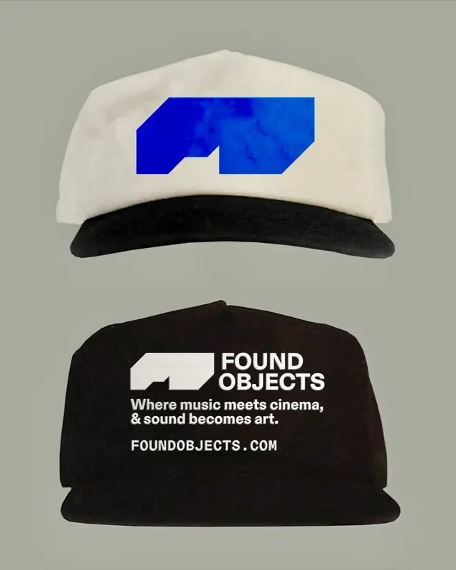
Found Objects branding pairs a structured white cap with an embedded geometric blue logo against a taupe background, with matching black cap showing the logotype and tagline.
Summary
Found Objects branding pairs a structured white cap with an embedded geometric blue logo against a taupe background, with matching black cap showing the logotype and tagline.
Visual description
A two-cap merchandising layout on a neutral gray background. Upper cap: white structured six-panel cap with a bright cobalt blue geometric logo (a sharp, angular abstract form) centered on the front. Lower cap: black cap displaying white sans-serif logotype "FOUND OBJECTS" with tagline "Where music meets cinema, & sound becomes art." below, plus a small white geometric mark to the left of the text. The geometry is clean and modern, with sharp angles reinforcing the logo's abstract identity. Strong contrast between the navy blue and white graphics against warm taupe and black bases.
Key takeaway
The pairing of a visual mark (geometric, bold) with verbal branding on merchandise; the way the same geometric element anchors both caps but serves different roles (decorative on white, textual anchor on black). High-contrast color deployment making the logo read distinctly on each surface.
Reuse notes
Effective for music, media, or creative-technology brands using merchandise as brand vehicle. The geometric logo translates well to caps, patches, or woven elements. Works best when the brand story justifies the tagline prominence on darker pieces.
More like this





Keep what you find
A free account saves references to boards and can send you a weekly email of picks based on what you save.
To see every result, go Pro.