Preview image. Unlock full-res
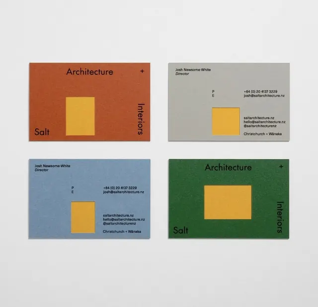
Four business card variations for an architecture firm, each pairing a solid background color with a centered golden-yellow rectangle and right-aligned contact.
Summary
Four business-card variations for Salt Architects: each features a solid color background (rust, sage, slate, forest) with a centered golden rectangle and right-aligned typography listing contact and disciplines.
Visual description
Four horizontally arranged business cards on a light gray background. Each card shows a different solid background color (rust orange, muted sage, slate blue, forest green), with a centered golden-yellow rectangle occupying roughly the vertical center. The "Salt" wordmark appears in the lower left; "Architecture" and "Interiors" appear vertically along the right edge in a condensed sans-serif. The second and fourth cards include contact information (phone, email, web, location) aligned to the right in small type. The golden rectangle is identical in size and proportion across all four, creating a consistent modular anchor.
Key takeaway
The reusable golden-rectangle module that unifies the system despite color variation. The vertical-text treatment along the edge saves space and adds visual rhythm. Minimal text labeling creates a restrained, high-end feel typical of architecture practice.
Reuse notes
Ideal for any brand identity where a color palette is key and a single geometric accent must scale across variations. The approach generalizes to postcards, letterhead, or signage. Works because the rectangle is truly centered and identical—swapping colors alone feels systematic, not chaotic.
More like this




Keep what you find
A free account saves references to boards and can send you a weekly email of picks based on what you save.
To see every result, go Pro.