Preview image. Unlock full-res
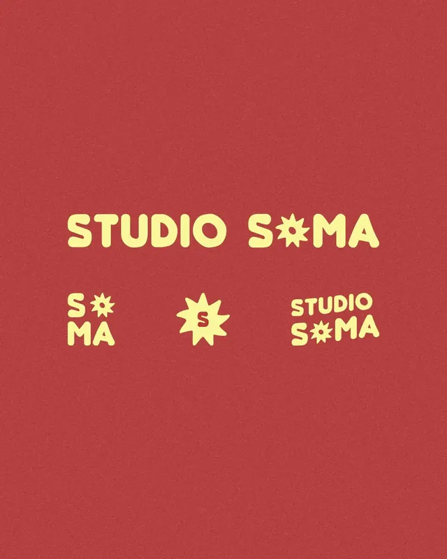
Playful all-caps logotype on terracotta ground with cream sans-serif letterforms and a stylized sun icon replacing the 'O'.
Summary
A playful studio logotype pairing bold all-caps sans-serif with a geometric sun icon, rendered in cream on a warm terracotta field.
Visual description
The composition centers a large, cheerful logotype reading "STUDIO SOMA" in a chunky, geometric sans-serif. The 'O' in both instances is replaced by a stylized sun icon with rays. The cream-colored letterforms sit against a solid terracotta-red background. Below the main heading, smaller scale repetitions and the isolated sun icon are arranged symmetrically in the lower portion of the frame, creating a cohesive visual system. The overall effect is warm, approachable, and distinctly retro without pastiche.
Key takeaway
The sun-as-O substitution works as both a logo and a repeatable graphic element. The spare, playful geometry keeps it modern despite the retro warmth. High contrast between the warm red and cool cream creates visual punch without complexity.
Reuse notes
Perfect for creative studios, design agencies, or brands wanting friendly yet sophisticated warmth. The logotype system scales well for applications. Works best on warm-toned substrates.
More like this
Keep what you find
A free account saves references to boards and can send you a weekly email of picks based on what you save.
To see every result, go Pro.