Preview image. Unlock full-res
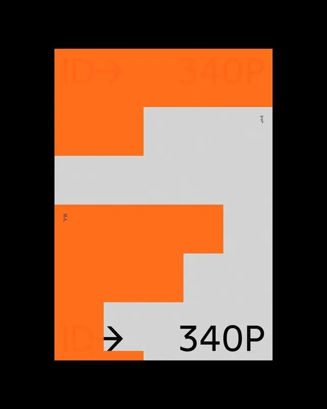
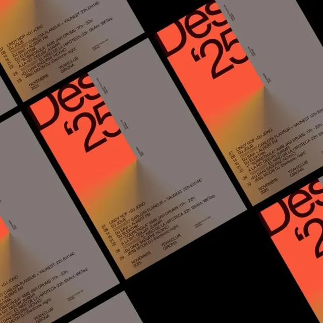
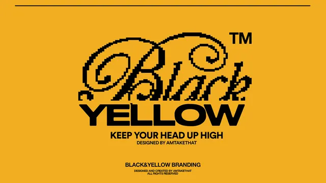
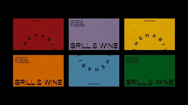
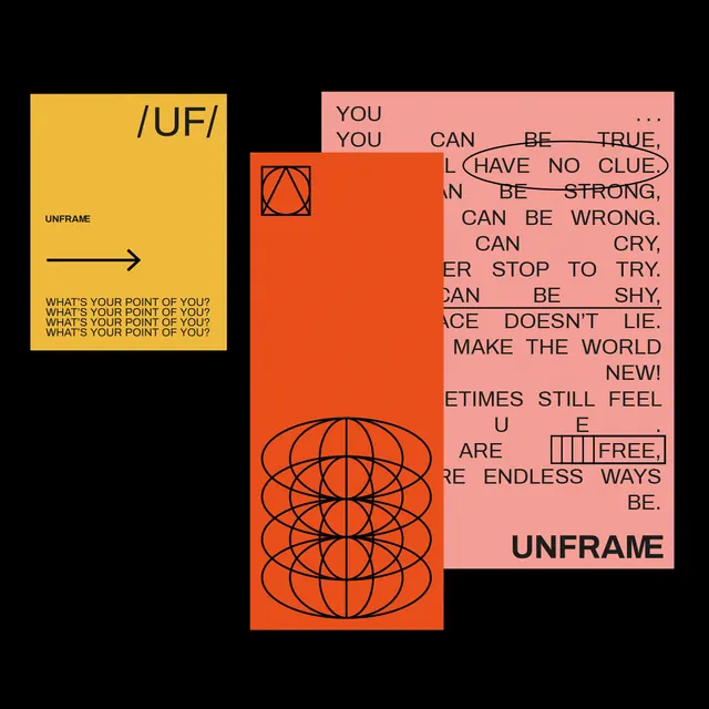
High-contrast collage of overlapping geometric panels in golden yellow, burnt orange, and coral pink with fragmented sans-serif type spelling out conceptual phrases against black.
Summary
A provocative collage of three staggered colored panels with fragmented typography and geometric line patterns, combining aggressive color contrasts and antilinear text placement to challenge conventional hierarchy.
Visual description
Black background. Three overlapping rectangular panels arranged in staggered positions: left panel is golden yellow, upper-right is burnt orange with concentric-circle line patterns, lower-right is soft coral pink with broken sans-serif type reading phrases like "You can be true" and "You can be strong" scattered at various angles and alignments. Left-side yellow panel contains small text blocks and an arrow pointing right. A bold geometric globe-like sphere of overlapping circles sits in the orange panel. Type deliberately fragments across panels and rotations to disrupt conventional reading order. The word "UNFRAME" appears at bottom-right in dark text on the coral panel.
Key takeaway
The staggered, overlapping-panel composition creates visual tension and depth without a traditional grid. Deconstructed typography as a conceptual device reinforces an intellectual or experimental message. The warm color triad (yellow, orange, pink) pops dramatically against black while staying harmonious. Geometric patterns as secondary visual texture add sophistication to what could otherwise feel chaotic.
Reuse notes
Ideal for brands in art, education, alternative media, or activist spaces. The brutalist energy reads as thoughtful, not careless. Works well for posters, book covers, or editorials where breaking hierarchy serves the message. Requires a strong concept; the disruption itself should mean something. Less suitable for conservative or mainstream B2B contexts.