Preview image. Unlock full-res
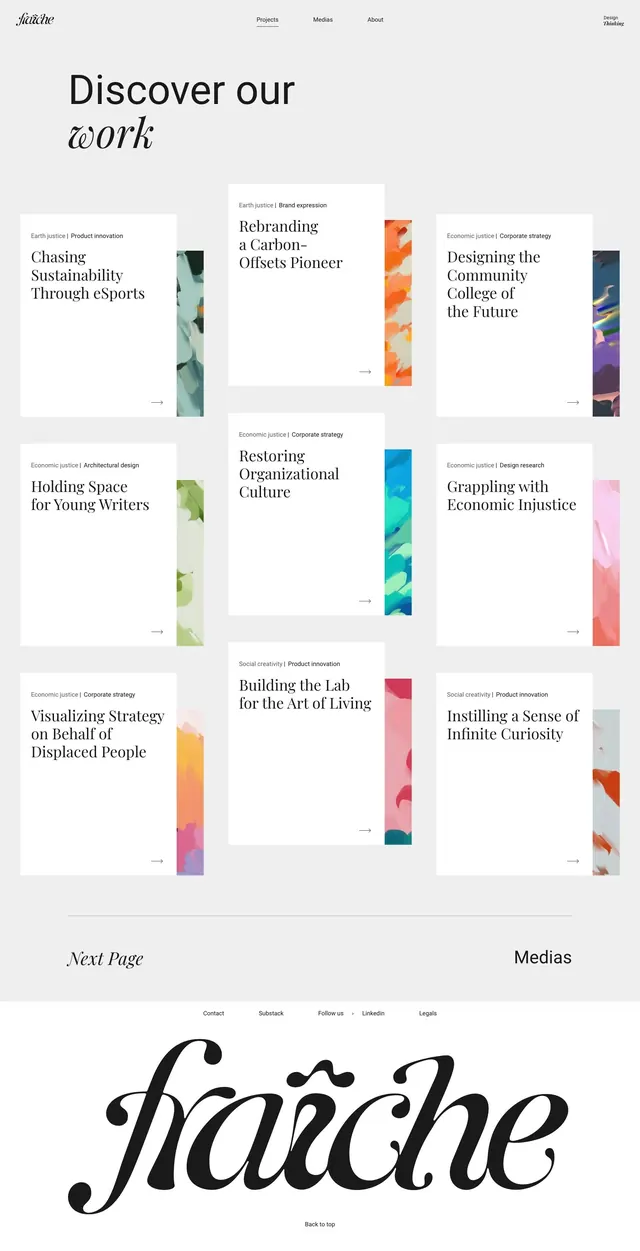
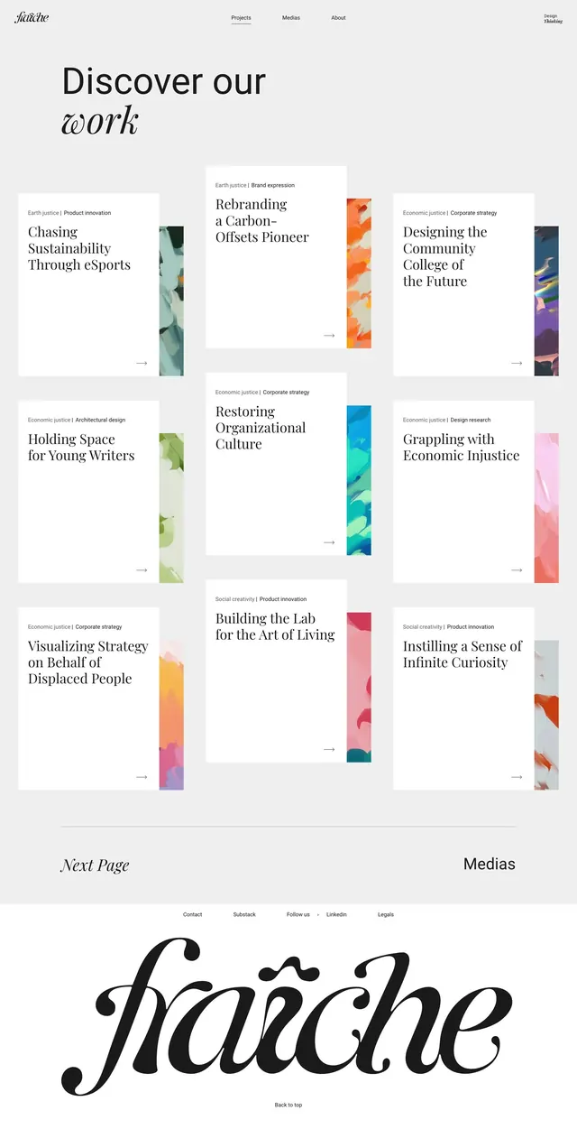
A portfolio gallery page using a 2x3 grid of project cards, each with a small title block and a tall vertical gradient bar, anchored by a serif headline and script footer.
Summary
A portfolio gallery page using a 2x3 grid of project cards, each with a small title block and a tall vertical gradient bar, anchored by a serif headline and script footer.
Visual description
The page opens with a bold serif headline "Discover our" paired with an italicized "work" in a contrasting font style. Below, six white cards arranged in a grid, each with a small header block (category label + project title in sans-serif) and a companion vertical bar spanning the full card height. The bars feature smooth color gradients: coral-to-purple, orange-to-pink, teal-to-cyan, yellow-to-pink, and multicolor transitions. Small category labels appear above each project (Brand expansion, Corporate strategy, Product innovation). At the bottom, a bold italic script typeface spelling "Karache" serves as a design element, with navigation links and a "Medias" label completing the footer. Ample whitespace surrounds all elements, reinforcing a gallery-like aesthetic.
Key takeaway
The vertical gradient bar as a companion element to text-heavy cards: it provides color interest and visual rhythm without cluttering the layout. The restrained color palette (mostly muted tones with vibrant bars) creates focus. The hierarchy of serif headline, sans-serif body, and decorative script footer is clean and readable.
Reuse notes
Strong for creative agency portfolios, design studio case studies, or any work that benefits from visual breathing room. The gradient bars work especially well for categorizing or distinguishing projects. Requires quality photography or illustration pairings to balance the spare typography.