Preview image. Unlock full-res
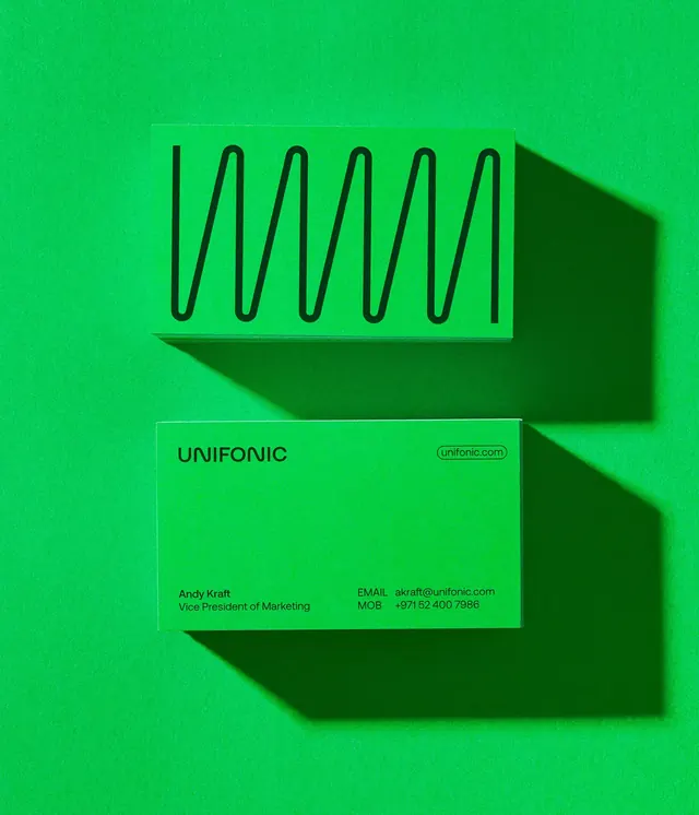
A minimal brand identity for Unifonic (CEO Andy Kraft) built on vibrant lime green, black line art, and layered drop shadows, featuring a wavy acoustic waveform mark and a single-color business card.
Summary
A minimal brand identity for Unifonic (CEO Andy Kraft) built on vibrant lime green, black line art, and layered drop shadows, featuring a wavy acoustic waveform mark and a single-color business card.
Visual description
A solid neon-lime background (#05CB57) fills the entire frame. In the upper-left quadrant, a wavy line mark (resembling an audio waveform or frequency curve) is drawn in thin black strokes, sitting atop a darker forest-green trapezoid that casts a sharp, offset drop shadow. Below the mark, a horizontal business card in the same lime green displays the company name "UNIFONIC" in black sans-serif (medium weight, all-caps), a small gray "Introduced" label, and contact details: "Andy Kraft / Vice President of Marketing / EMAIL: jackfruit@unifonic.com / LFONO: +60 762 2288". The card also casts a visible shadow onto the background, creating the illusion of layered depth. The entire composition uses only three colors: the bright green ground, black lines, and dark green shadow planes.
Key takeaway
The bold, single-color background provides instant brand recognition and memorability. The wavy mark is simple enough to work at any scale (favicon, app icon, stationery) while remaining distinctive in its acoustic/audio interpretation. The drop-shadow technique adds playful dimensionality without complexity. The restraint to black, white, and one vibrant hue makes the identity remarkably flexible and printable.
Reuse notes
Ideal for tech startups, SaaS, or audio/music brands wanting a fresh, confident identity. The lime green reads energetic and modern; dial back the brightness if your brand is more conservative. The shadow effect works best in 2D contexts (print, digital mocks); for web animation, consider a flat variant. Works well alongside geometric sans-serifs (Inter, Helvetica, Montserrat). The business card composition is very practical for stationery systems or collateral templates.
More like this




Keep what you find
A free account saves references to boards and can send you a weekly email of picks based on what you save.
To see every result, go Pro.