Preview image. Unlock full-res
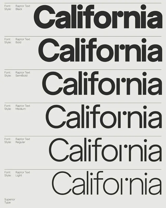
Type specimen showing the word 'California' rendered in six weights of Raptor Text sans-serif (Black, Bold, SemiBold, Medium, Regular, Light) against gray and white striped field.
Summary
Complete weight and style progression of Raptor Text sans-serif, from Black through Light, displayed vertically with thin horizontal dividers on a neutral gray and off-white striped background.
Visual description
Six stacked specimens, each on a light field with a thin horizontal line above and below. Each row begins with labeled type information (Font: Raptor Text, Style: [Black/Bold/SemiBold/Medium/Regular/Light]) left-aligned in small sans-serif. The word 'California' is rendered in black in each corresponding weight. The typeface shows distinctive features across the ramp: widened letterforms, prominent round terminals on the capital 'C' and lowercase letters, and consistent stroke modulation. Background alternates subtly between warm off-white and cool light gray. A thin line of credit text ("Superior Type") appears at bottom left.
Key takeaway
The clarity of showing all weights in one vertical scan without thumbnails or comparison matrices. The thin horizontal dividers provide visual rhythm and structure. The consistent framing and labeling make this a reusable template for any typeface specimen.
Reuse notes
Use as a model for documenting your own type systems. The subtle stripe pattern adds visual interest without competing with the letterforms. Most effective for sans-serifs with pronounced terminals and modulation, like Raptor Text. Scale this approach for sales decks, design systems, or font catalogs where weight progression is a key selling point.
More like this




Keep what you find
A free account saves references to boards and can send you a weekly email of picks based on what you save.
To see every result, go Pro.