Preview image. Unlock full-res
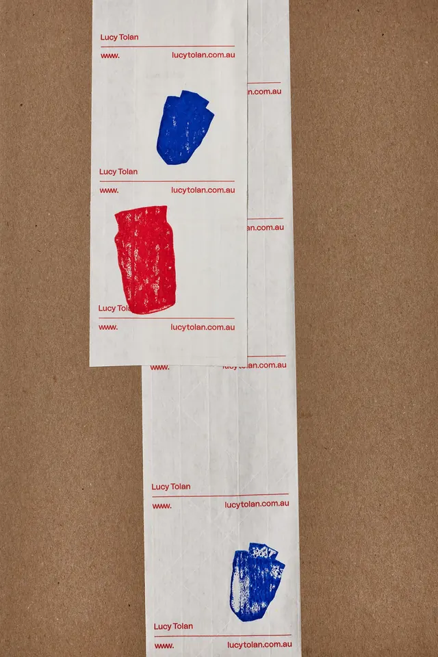
A suite of vertical business sticker labels featuring clean contact info and distressed gestural ink marks in red and blue, communicating handcrafted authenticity.
Summary
Vertically oriented sticker-label sheets on white cardstock, each bearing a designer's name, website URL, and a single distressed gestural mark in red or blue ink, printed on kraft or natural paper.
Visual description
Cream or white cardstock sheets are arranged vertically, slightly overlapping, on a kraft paper backing. Each label features the name "Lucy Tolan" in small dark sans-serif, horizontally centered, with a website URL (lucytolan.com.au) below. A distressed organic shape (gestural ink mark, not a precise geometric form) appears as a focal point in red on some labels and cobalt blue on others. The marks have visible printing artifacts (ink bleed, texture, surface variation), conveying handmade or letterpress production. The labels are clean and minimal in construction but charged with the textural authenticity of the ink marks. Typography is functional, secondary to the visual impact of the printed color shapes.
Key takeaway
Pairing minimal clean typography with prominent distressed or organic printed marks for visual interest and personality; using a limited but vivid color palette (red + blue) to make standard sticker labels memorable; the interplay between technical precision (name, URL, grid layout) and expressive imprecision (ink mark texture) that reads as intentional and craft-focused; vertical or portrait orientation for stickers, which stands out among horizontal business cards.
Reuse notes
Effective for designers, illustrators, studios, or any maker whose brand identity benefits from showing, not just telling, their aesthetic. The distressed printing technique is achievable through risograph, letterpress, or traditional offset with deliberate ink variation. Works especially well for in-person distribution (conferences, portfolio reviews, mail campaigns). The label format is more memorable and shareable than a standard card. Test the ink coverage and mark visibility at actual print size and paper stock; distress effects can disappear if the substrate is too absorbent or if the ink ratio is too thin.
More like this





Keep what you find
A free account saves references to boards and can send you a weekly email of picks based on what you save.
To see every result, go Pro.