Preview image. Unlock full-res
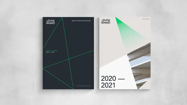
Two parallel architectural design covers for Wamid brand using bold geometric lines and stark light/dark contrast.
Summary
Two branded covers for Wamid showing a study in geometric precision: one dark with luminous teal diagonal lines, one light with layered photography and a teal gradient.
Visual description
Left cover is charcoal-black with bright teal geometric lines dividing the rectangular composition into angular zones. Wamid wordmark (Arabic and Latin letterforms stacked) sits top-left in white; minimal metadata text (dates, credits) floats below in small sans-serif. Right cover bleeds white, dominated by a stacked photographic section (architectural detail, neutral tones) occupying the middle half, with teal gradient triangle anchoring the top-right corner. Large "2020 2021" date sits bottom-left. Both use clean, all-caps sans-serif with generous spacing. Typography is restrained; white space is structural.
Key takeaway
The use of single accent color (teal) as both line and gradient across opposing contrast environments (dark to light). The geometric grid divides the dark cover while photography fills the light one, each reading as a complete system. The structural approach to negative space makes minimal text feel like architecture.
Reuse notes
Strong pattern for design-systems documentation, studio portfolios, and annual reports. The two-tone approach works when showing process or dual narratives (before/after, two markets, archive to present). Requires high-quality photography on the light side to balance geometric severity.
More like this



Keep what you find
A free account saves references to boards and can send you a weekly email of picks based on what you save.
To see every result, go Pro.