Preview image. Unlock full-res
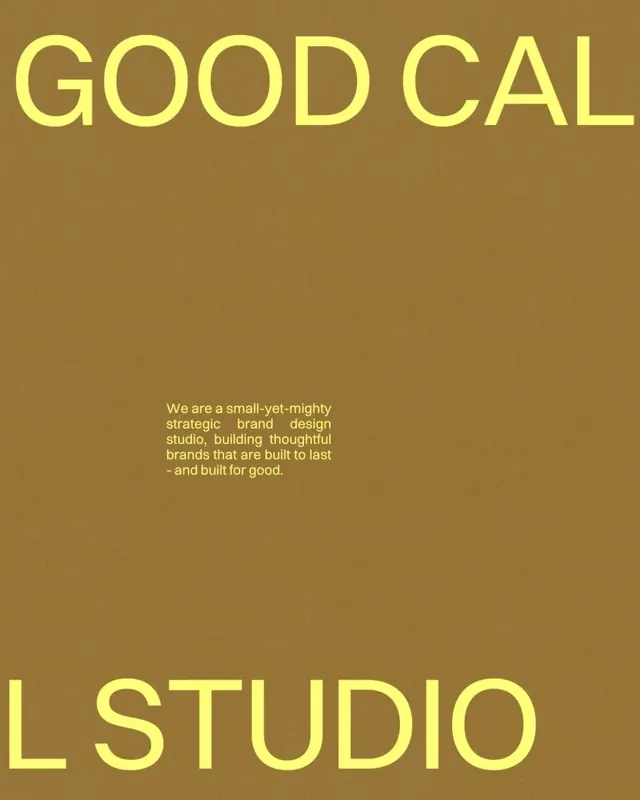
Good Cal Studio wordmark in oversized yellow-gold letters on warm taupe ground, with tagline describing the studio's mission.
Summary
Good Cal Studio wordmark in oversized yellow-gold sans-serif on a warm taupe background, anchored by a mission statement about strategic brand design.
Visual description
The composition centers two typographic elements on a warm golden-taupe ground. At the top, "GOOD CAL" appears in large, letter-spaced sans-serif capitals rendered in a bright yellow-gold with minimal stroke weight. Below the fold, "L STUDIO" continues the wordmark in the same typeface and color. Between the two text blocks, centered, sits a moderate-sized justified body-copy block in a lighter shade of the same gold describing the studio as "a small-yet-mighty strategic brand design studio, building thoughtful brands that are built to last and built for good." The overall layout is vertically stacked and symmetrical, relying on whitespace and type hierarchy.
Key takeaway
The warm, earthy color palette (taupe + gold + supporting neutrals) conveys approachability and craftsmanship without feeling dated. Splitting the wordmark across the layout creates a visual breathing room and lets the mission statement become part of the identity rather than a footnote. The oversized, confident letterforms establish authority without coldness. Light-to-bright gold on darker taupe maintains strong contrast for legibility.
Reuse notes
Ideal for design studios, strategic consultancies, and mission-driven brands wanting warmth and sophistication simultaneously. The palette works well at small scale (business card, favicon) and large scale (poster, hero). Pairs naturally with documented case studies and client work. The tonal relationship between the wordmark and body copy reduces visual clutter.
More like this



Keep what you find
A free account saves references to boards and can send you a weekly email of picks based on what you save.
To see every result, go Pro.