Preview image. Unlock full-res
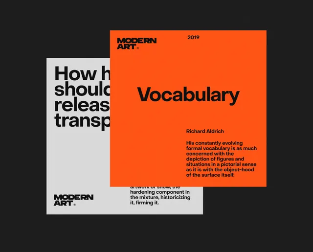
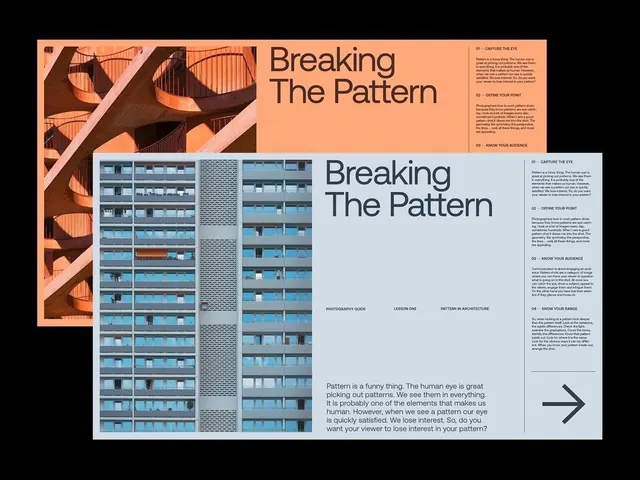
Two overlapping editorial cards for a Modern Art piece, one white with a large Vocabulary headline and one bright orange running body copy, both stamped with a small MODERN ART wordmark and tilted on a black ground.
Summary
A brand or article layout for "Modern Art" shown as two overlapping rectangular cards, one white, one vivid orange, slightly rotated on a near-black background so they read as a stacked print system.
Visual description
The back card is white and carries a small dense block of body text plus a "MODERN ART" wordmark with a registration-style dot. The front card flips to a saturated orange field: a "MODERN ART" tag and a year sit at the top, a large black "Vocabulary" headline anchors the upper third, an author byline follows, and a justified paragraph of running text fills the lower half. Both cards are tipped a few degrees off-axis and casually overlapped, and the whole pair floats on a flat dark ground that pushes the orange forward.
Key takeaway
The two-card overlap, identical grid in inverted colorways (white-on-dark text vs black-on-orange), to show one editorial system in two states in a single frame. The tiny repeated wordmark used as a consistent corner stamp across both cards.
Reuse notes
A handy way to present a publication or content brand: art magazines, essay series, exhibition collateral. The off-axis tilt makes a flat-lay feel art-directed; keep the rotation subtle so copy stays readable. Pair the orange with a true black ground for the contrast to land.
More like this

Keep what you find
A free account saves references to boards and can send you a weekly email of picks based on what you save.
To see every result, go Pro.