Preview image. Unlock full-res
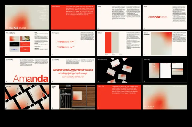
A complete brand identity for Amanda showing cohesive stationery, signage, and environmental applications unified by coral-to-neutral gradients and minimalist geometric forms.
Summary
A complete brand identity system for Amanda demonstrating seamless application of coral-to-cream gradients and minimal geometric elements across stationery, signage, and interior environments.
Visual description
The identity grid displays 16 application mockups arranged in a 4x4 layout, each showing a different touchpoint. Top-left quadrants feature the wordmark treatment and business cards with the signature coral-to-neutral gradient bloom effect. Center sections show stylized spreads with coral red accents, cream backgrounds, and dense typographic layouts with generous margins. Bottom-right includes wood-grain photography paired with the charcoal primary color, suggesting luxury retail or hospitality application. Throughout, the gradient functions as a unifying element: soft coral fades to warm beige or cream, creating depth without relying on imagery. The sans-serif wordmark "Amanda" appears in both solid and gradient versions. Grid structure and modular spacing create visual order across diverse applications.
Key takeaway
The gradient-as-unifier technique: a simple coral-to-cream blend repeats across every application (card, letterhead, poster, signage) without feeling repetitive because the gradient's angle and intensity vary per context. Pairing warm color with natural wood textures and minimal typography creates premium positioning without ornament. The restraint of the color palette (three core hues plus neutrals) makes the system coherent and extension-friendly.
Reuse notes
Strong reference for designing cohesive identity systems that bridge print collateral, interior environments, and digital touchpoints. Works particularly well for boutique agencies, design studios, hospitality, or luxury consumer brands. The gradient approach requires a touch of restraint to avoid feeling dated; pair it with modern, open typography and plenty of whitespace.
More like this





Keep what you find
A free account saves references to boards and can send you a weekly email of picks based on what you save.
To see every result, go Pro.