Preview image. Unlock full-res
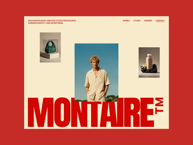
A studio website hero with oversized red wordmark anchoring the bottom, centered cream panel with product and editorial photography, and sparse navigation in the header.
Summary
A studio portfolio website hero featuring an oversized bright-red wordmark (MONTARE+TW) in the lower third anchoring a cream-colored central panel with a sparse header navigation and three product/editorial photography thumbnails placed asymmetrically.
Visual description
Bright red full-bleed background. Centered pale cream rectangle contains the main content. Top left: red all-caps text block describing the studio (one sentence, small size). Top right: horizontal navigation menu items (WORKS, STUDIO, AWARDS, CONTACT) with underline on CONTACT. Center area: three rectangular photographic thumbnails arranged asymmetrically, showing a green handbag on stone, a portrait of a man in cream shirt against blue sky, and a bronze bottle with black fabric. Below the photographs, the lower two-thirds of the cream panel is occupied by the massive red wordmark "MONTARE+TW" (all-caps, sans-serif, very heavy weight) which breaks out of and overlaps the photograph area. The red extends to the full-bleed edges, creating a bold frame around the entire composition.
Key takeaway
The wordmark-as-anchor strategy: by pushing the logo into the lower half and allowing it to overlap imagery, the designer creates visual drama without sacrificing legibility. The three-photo grid creates portfolio credibility while remaining editorial. Bright red against cream achieves maximum contrast without feeling aggressive. The sparse header with underlined link signals interactive sophistication.
Reuse notes
Strong choice for creative agencies, design studios, and fashion or product-focused portfolios. Works best when photography is curated and high-quality. The bold red may overwhelm softer brand identities; test contrast against your primary color. Logo placement overlapping imagery works only when the images are strong enough to support it.
More like this


Keep what you find
A free account saves references to boards and can send you a weekly email of picks based on what you save.
To see every result, go Pro.