Preview image. Unlock full-res
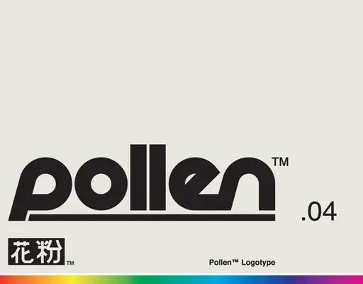
A bold geometric sans-serif logotype spelling 'pollen' with a slashed 'e', set on light gray with a rainbow gradient strip below and specimen label reading '.04'.
Summary
A bold, geometric sans-serif logotype spelling "pollen" with closed, circular letterforms, set against neutral gray with a full-spectrum rainbow gradient bar and a version label ".04" positioned to the right.
Visual description
The logotype features the word "pollen" rendered in a heavy, modern geometric sans-serif where each letter is built from smooth, nearly circular forms (particularly the 'o', 'e', 'l' shapes). The 'e' contains a subtle slash accent. The entire wordmark sits on a light gray background with black ink. At the bottom of the composition, a full-spectrum gradient bar spans horizontally, showing red, orange, yellow, green, cyan, blue, and magenta in sequence. To the right of the mark, the version label ".04" is typeset in a smaller sans-serif. Above the wordmark, small supplementary marks appear (including what reads as a stylized flower or character mark in the upper-left corner, labeled with a trademark symbol). The specimen's overall presentation emphasizes the geometric consistency and closed-curve letterform logic that defines the typeface.
Key takeaway
Geometric letterforms with consistent bowl sizes and proportions as the design's core identity. A full-spectrum gradient bar as proof of the typeface's versatility. The restrained, specimen-like layout (neutral background, minimal ornament) that lets the type speak. The use of closed, circular forms to convey modernity and friendliness without losing typographic authority.
Reuse notes
Strong reference for designing geometric typefaces or logotypes targeting cosmetics, natural products, pharmaceuticals, or lifestyle brands where approachability + refinement matter. The rainbow bar signals versatility across brand applications. The specimen format works for any display typeface designed to have a distinct geometric or structural story. Version numbering at the specimen edge is appropriate for fonts intended for distribution or licensing.
More like this






Keep what you find
A free account saves references to boards and can send you a weekly email of picks based on what you save.
To see every result, go Pro.