Preview image. Unlock full-res
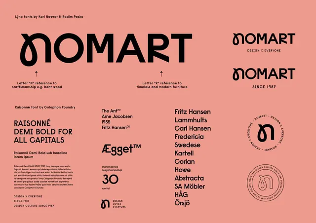
A typography specimen on warm coral ground showcasing the Lino and Raisonne font families with logotype variations, design philosophy references, and international typeface pairings.
Summary
A typography specimen on warm coral background showcasing Nomart's Lino and Raisonne font families with design intent, reference notes, and paired typefaces from foundries like Colophon, Fritz Hansen, and others.
Visual description
Warm coral background with black typography and design elements. The composition centers around two logotype treatments of "Nomart" at different sizes and weights. Below, the designer credits "Lino fonts by Karl Nawrot & Radim Pesko" and "Raisonne font by Colophon Foundry" are paired with explanatory notes about design philosophy (Lino's "N" references craftsmanship; "R" references modern furniture). A substantial block of justified body copy in Raisonne sits in the lower left. The right column features a curated list of complementary typefaces (The Ant, Egget, Fritz Hansen, Lammhults, Carl Hansen, Fredericia, Swedese, Kartell, Corian, Hove, Abstracta, SA Mobler, HAG, Orsjoe) with small design/cultural credits below each. A circular badge at the bottom right says "Design x Everyone, Design Culture Since 1987."
Key takeaway
The restrained, single-color (black) typography approach letting face choice drive visual hierarchy. The combination of logotype exploration and specimen reference text in one artifact. The paired design credits that contextualize type choices within brand values.
Reuse notes
Effective model for a design-system or foundry specimen. Works well for editorial portfolios or design-culture documentation. Best suited to brands or projects with a strong typographic backbone and philosophical positioning.
More like this





Keep what you find
A free account saves references to boards and can send you a weekly email of picks based on what you save.
To see every result, go Pro.