Preview image. Unlock full-res
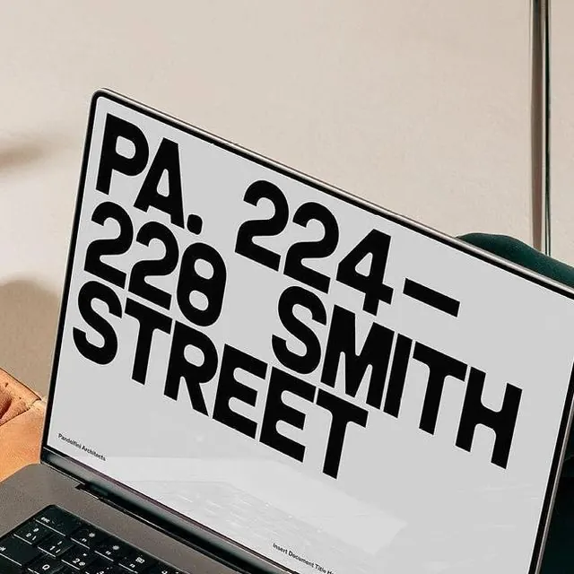
Bold, sans-serif address typography (PA 228 SMITH STREET) displayed on a tilted card in black and off-white, architectural flat-lay style.
Summary
A real-estate or property address rendered in bold, condensed sans-serif and mounted at an angle on a card, creating a stark architectural branding statement in black and off-white.
Visual description
A printed or displayed card tilted at roughly 30 degrees on a keyboard, showing "PA 228 SMITH STREET" in oversized, all-caps condensed sans-serif. The text is jet black on an off-white background, with generous negative space. The composition is asymmetric and geometric, emphasizing the address as the sole content. Soft shadows and the flat-lay setup (keyboard border visible, warm paper tones in the background) ground the typography in a physical, branded context.
Key takeaway
The tight, condensed wordmark treatment for location-based identity, the angled presentation that adds dynamism to static text, and the discipline of limiting the composition to address-only with no supporting visuals or ornaments.
Reuse notes
Strong for real-estate, property, or local/site-specific branding that needs architectural authority. Works best when the address itself is a brand asset (e.g., flagship locations, heritage buildings). The condensed weight and high contrast support legibility even at the angle and in flat-lay photography.
More like this







Keep what you find
A free account saves references to boards and can send you a weekly email of picks based on what you save.
To see every result, go Pro.