Preview image. Unlock full-res
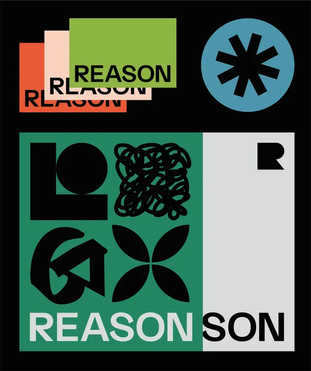
Reason brand identity combining stacked wordmark overlays with a modular geometric icon system in teal, green, and black.
Summary
A corporate identity system featuring the name "Reason" built from geometric components: stacked rectangular wordmarks in coral, cream, and lime; a circular icon with black spokes on teal; and a modular symbol grid on dark green combining circles, curves, and angular marks.
Visual description
The composition arranges identity elements on a black background. Top left: three overlapping instances of "REASON" in white sans-serif, each on a separate colored rectangle (coral, cream, lime-green) creating a layered effect. Top right: a teal circle containing a symmetrical 8-pointed star or asterisk in black, suggesting a strong secondary mark. Bottom half: a dark-green square (nearly filling the lower canvas) divided into four quadrants by black outlines, each containing modular geometric marks: a solid circle, curved organic lines, a four-petaled flower shape, and an angular arrow-like form. A white "REASON" wordmark sits in the bottom right on light gray. The palette is strictly limited to black, white, grays, teal, green, and coral against the dark background.
Key takeaway
The layering technique for wordmarks creates depth without weight change. The modular mark system is infinitely extensible: each quadrant operates independently but coheres through a shared geometric language, making it perfect for pattern systems or animated transitions. The color restraint, even with warm and cool accents, keeps the identity readable at scale.
Reuse notes
Suits b2b and corporate contexts where identity needs to feel both playful and trustworthy. The geometric icons work well as social-media avatars, app icons, or responsive web headers. Avoid using all elements at once on small screens; the layered wordmarks work best at display sizes.
More like this




Keep what you find
A free account saves references to boards and can send you a weekly email of picks based on what you save.
To see every result, go Pro.