Preview image. Unlock full-res
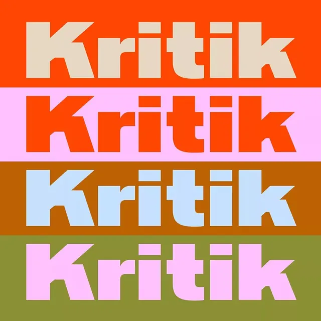
Display typeface 'Kritik' rendered in four colorway variations stacked vertically, each on a saturated background stripe of orange, pink, brown, and green.
Summary
Display typeface "Kritik" repeated four times in identical form, each instance rendered in white or light color on saturated backgrounds of orange, pink, brown, and green.
Visual description
A vertical stack of four equal-height color bands, each containing the word "Kritik" in a bold, wide display sans-serif typeface. The letterforms feature a distinctive angled cut on the K, creating a graphic, recognizable silhouette. The first band is bright orange with cream-white letters; the second is hot pink with orange letters; the third is dark brown with light blue letters; and the fourth is olive green with pink letters. All four variations maintain identical proportions and kerning, creating a systematic color exploration of a single typeface.
Key takeaway
A modular color-system approach to type specimens, where one typeface is shown across multiple backgrounds to explore its versatility; the consistent visual impact of the typeface despite color changes; the use of complementary color pairs (orange/blue, green/pink) to heighten contrast and legibility.
Reuse notes
Excellent reference for designing type specimens, brand guidelines with color-system documentation, or poster campaigns exploring a single typeface across multiple applications. The method works well for selling typefaces or demonstrating flexible branding. Use when you need to show that a typeface reads clearly across diverse colorways or when establishing a core design system.
More like this

Keep what you find
A free account saves references to boards and can send you a weekly email of picks based on what you save.
To see every result, go Pro.