Preview image. Unlock full-res
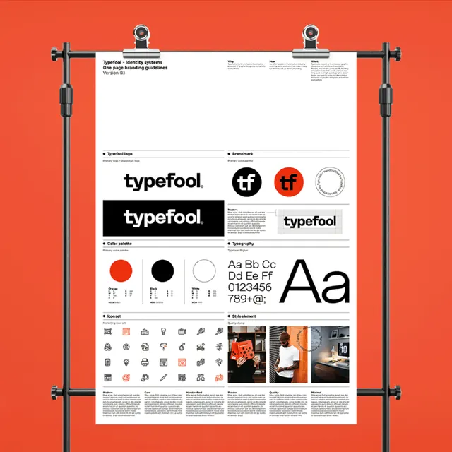
Type specimen sheet showing the Typefool font family with wordmark variations, color swatches, icon sets, and product photography, mounted on a red mat.
Summary
A specimen sheet for Typefool, mounted under corner brackets on a red mat, displaying the font, brand colors, icons, and usage photography in a disciplined grid.
Visual description
A white spec sheet is held flat against a bright red background using four black corner brackets. The sheet itself is organized into six distinct zones: top left shows the Typefool wordmark in several treatments (monochrome, and in black with red accents); a color palette of two circles (bright red and deep black) with supporting gray swatches; a grid of small UI icons in black; the sans-serif typeface in display sizes showing "Aa" in both regular and bold weights; and bottom right, sample color photography of the identity in use (appears to be product or interior imagery in warm tones). The grid structure is strict, with generous white space between sections and consistent alignment.
Key takeaway
The economical use of just two colors plus black and white, where the bright red acts as the accent and the sans-serif sits in the design hierarchy without custom type. The compact, magazine-style layout that packs font, color, icons, and real-world application into one visual without feeling crowded. The mounting presentation itself (the red mat with bracket hardware) as a physical artifact that adds craft and authority to the spec.
Reuse notes
Ideal template for a standalone font release or a small brand identity package where the typeface is the primary asset. Works especially well for editorial, publishing, or agency brands. The mounting trick is a low-cost way to frame and present a spec sheet as a finished artifact worthy of gallery display.
More like this






Keep what you find
A free account saves references to boards and can send you a weekly email of picks based on what you save.
To see every result, go Pro.