Preview image. Unlock full-res
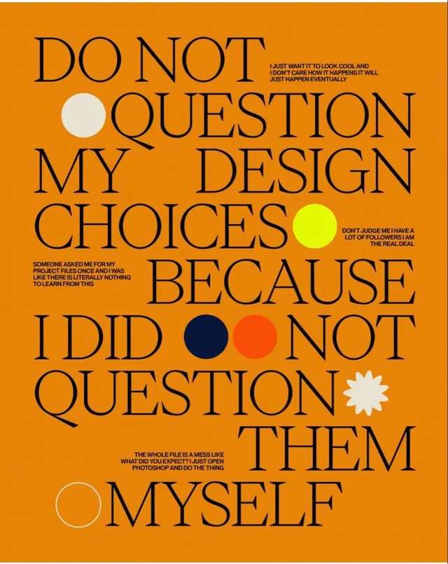
A self-promotional designer's poster layering confident manifesto copy over an orange field with geometric circle callouts and a minimalist sans-serif outline typeface.
Summary
A self-promotional designer's manifesto poster emphasizing design autonomy, layered over a bright orange field with geometric circle callouts punctuating the typography and confidently-rendered manifesto copy.
Visual description
Bright burnt-orange background filled with oversized, outlined sans-serif letterforms spelling out key manifesto statements. Copy blocks include "DO NOT QUESTION MY DESIGN CHOICES BECAUSE I DID NOT QUESTION THEM MYSELF" and several shorter testimonial excerpts below. Colored geometric circles in white, bright yellow, navy blue, and coral red are positioned throughout to interrupt and accent the text hierarchy. A white six-pointed star shape appears near the bottom right. The entire composition relies on the contrast between the warm orange field and the outlined black strokes of the type, with sparse colored shapes creating a rhythmic visual punctuation.
Key takeaway
The use of geometric shapes as visual punctuation rather than functional elements; they break up solid type and guide the eye through the manifesto without containing or framing the content. The outlined approach to sans-serif letterforms creates a stencil-like efficiency and modern sensibility. The warm-on-warm palette (orange field with dark-orange and tan text accents) builds cohesion while the neon circles provide confident contrast.
Reuse notes
Strong for designer portfolios, agency self-promotion, or any brand manifesto where typographic conviction is the message. Works best at poster scale where the oversized type and negative space can breathe. Less effective on small screens or in narrow layouts. The color and tone read as highly confident and slightly irreverent, so suits creative/design-forward audiences.
More like this

Keep what you find
A free account saves references to boards and can send you a weekly email of picks based on what you save.
To see every result, go Pro.