Preview image. Unlock full-res
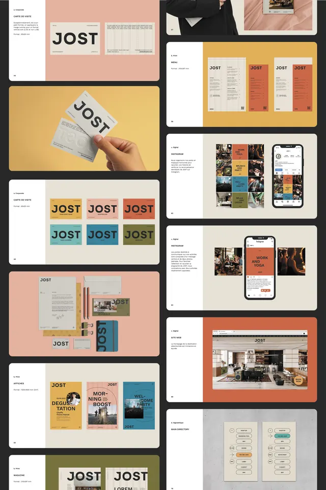
Complete corporate identity system for JOST showing modular applications across letterhead, color swatches, mobile UI, print collateral, and packaging using warm pastels and geometric blocks.
Summary
Complete corporate identity for JOST demonstrating modular, replicable design across business cards, printed matter, mobile interfaces, and environmental applications using warm pastels and geometric color blocks.
Visual description
A comprehensive brand showcase across six presentation boards: card and envelope specimens; a grid of color-swatch variations in cream, coral, and olive tones; a mobile UI layout with four swatch options; a mood board of photography and UI elements; an environmental application with JOST wordmark on textured surfaces; and a publication or poster layout with hierarchical type treatment. All applications maintain a consistent sans-serif typeface, warm earth-tone palette (cream, peach, soft coral, sage, warm gray), and use rectangular color blocks as the primary design device. Grid-based structure throughout ensures visual consistency across media.
Key takeaway
The modular color-swatch system that allows flexible brand expression across contexts (print, digital, environmental) while maintaining visual cohesion; the restrained palette of three to four warm tones that feel both contemporary and versatile; and the rigorous application of a single sans-serif across all scales and media without losing hierarchy.
Reuse notes
Excellent reference for building cohesive identity systems that scale across print, packaging, and digital. The warm, muted palette works well for lifestyle, design, or creative sectors. The swatch grid demonstrates how to present brand-color flexibility in a compelling way. Study how the same typeface family maintains hierarchy through size and weight alone, not color variety.
More like this




Keep what you find
A free account saves references to boards and can send you a weekly email of picks based on what you save.
To see every result, go Pro.