Preview image. Unlock full-res
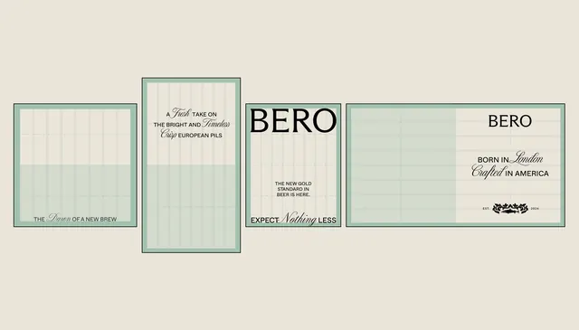
Craft beer branding system using a minimal five-panel layout with cream and muted green frames, restrained sans-serif and serif typography, and geometric proportional grids.
Summary
Craft beer label and packaging system for Bero using a modular five-panel layout with muted cream and green tones, combining serif and sans-serif type to signal European heritage and craft sensibility.
Visual description
Five rectangular label panels arranged horizontally on a cream background, each featuring a muted green-gray border frame. The left panel is a narrow square stating "THE SPIRIT OF A NEW BREW". The center-left taller panel uses both serif (script) and sans-serif type describing the beer as a "food-focused bright and harmless" brew with European roots. The center large square panel uses bold sans-serif for "BERO" with supporting copy "EXPECT NOTHING LESS" and "THE NEW GOLD STANDARD OF BEER IS HERE". The two right panels continue the system with "BERO" branding, secondary copy "BORN IN LONDON CRAFTED IN AMERICA", and decorative marks. All type sits on cream-colored panels within the green-gray frame structure. Generous horizontal line patterns fill the interior, creating visual rhythm and texture.
Key takeaway
The modular square-and-rectangle frame grid applied to a linear product lineup. The cool muted palette signaling premium craft without aggression. The intentional mix of serif and sans-serif type in one label, establishing European-heritage authenticity while remaining modern.
Reuse notes
Strong reference for beverage and food packaging that aims for European sophistication without luxury overkill. Works well for craft beer, spirits, or artisan food brands seeking a restrained, geometric identity. Scale-friendly: the panel system allows rapid variation while maintaining coherent visual language across SKUs.
More like this



Keep what you find
A free account saves references to boards and can send you a weekly email of picks based on what you save.
To see every result, go Pro.