Preview image. Unlock full-res
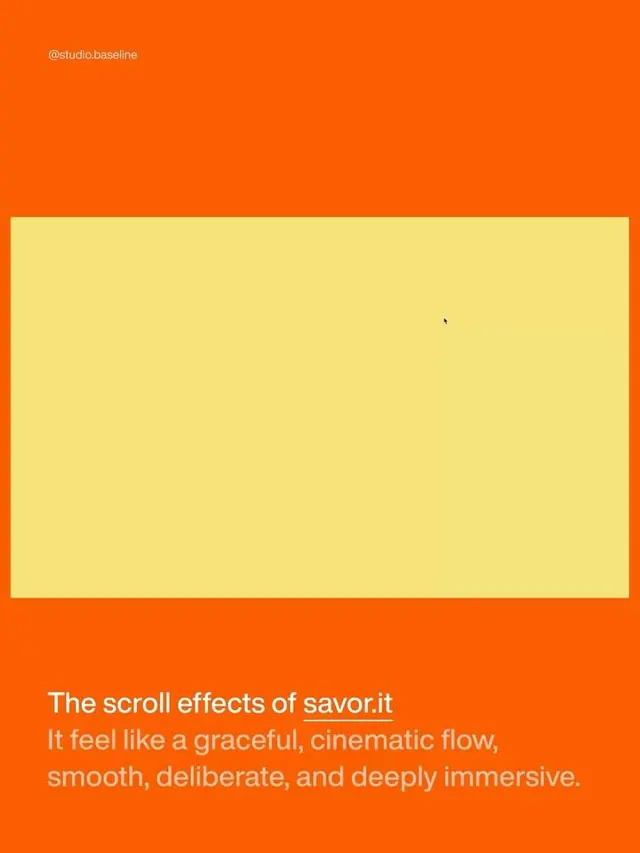
Studio Baseline portfolio piece with burnt-orange background, centered cream-yellow rectangle framing scroll-effect work, and white text describing the immersive experience.
Summary
Studio Baseline portfolio card using a vivid burnt-orange background and a large centered cream-yellow rectangle to frame their scroll-effect design work for savor.it.
Visual description
Burnt-orange (#FB5D02) fills the entire frame top and bottom, with a large centered pale yellow-cream rectangle occupying the middle third vertically. The handle @studio.baseline sits in small white text top-left. Below the rectangle, three lines of white sans-serif text describe the work: headline "The scroll effects of savor.it" followed by a description "It feel like a graceful, cinematic flow, smooth, deliberate, and deeply immersive." The rectangle itself is left blank, acting as a visual frame or preview window. The contrast between warm orange and cool pale yellow is high and deliberate; the composition is locked to vertical center with generous top and bottom orange bands.
Key takeaway
The framing technique: a large neutral rectangle carves out a preview window that makes you want to imagine what happens inside (or creates implied whitespace for a scroll-triggered animation reveal). The split between visual anchor (the frame) and text description below works better than mixing them, because your eye lands on the geometry first.
Reuse notes
Ideal for portfolio pieces that want to showcase interactive or motion work without showing the full mockup. Works well for highlighting a specific interaction moment. The 3:1 orange-to-content ratio feels confident and premium; scale it down and it reads cheaper. This exact palette reads 2021-2023 design trend; use warmer or cooler analogues for a fresher feel.
More like this


Keep what you find
A free account saves references to boards and can send you a weekly email of picks based on what you save.
To see every result, go Pro.