Preview image. Unlock full-res
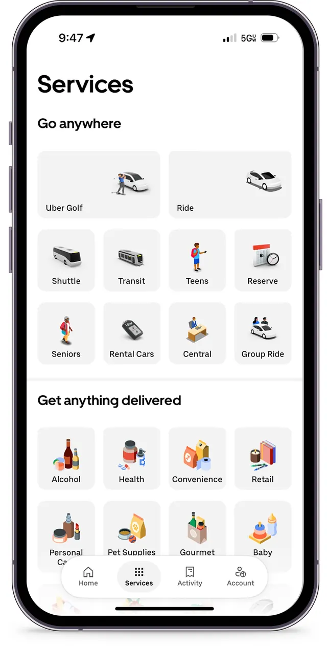
Ride and delivery services taxonomy screen with grid-based icon cards under two category headings and a five-item bottom navigation.
Summary
Uber Services app screen displaying two taxonomies (ride services and delivery categories) as 4x2 icon-and-label grids beneath section headings, with five-item bottom navigation bar.
Visual description
iPhone mockup showing full screen. Header "Services" with subheading "Go anywhere" opens to an 8-item grid of ride services: Uber Golf, Ride, Shuttle, Transit, Teens, Reserve, Seniors, Rental Cars, Central, Group Ride. Each icon is color-coded (red, orange, blue, green), label-captioned in sans-serif. Below, "Get anything delivered" section with another 8-item grid: Alcohol, Health, Convenience, Retail, Personal Care, Pet Supplies, Gourmet, Baby. Bottom tab navigation: Home (house icon), Services (selected, highlighted), Activity, Account. Light grey card backgrounds with subtle shadows create elevation and modularity.
Key takeaway
The two-heading structure organizes massive service catalog into digestible sections. Color coding on icons provides quick visual parsing without redundant labels. The taxonomy-as-grid pattern scales cleanly and is easy to scan. Simple tabbed navigation anchors the interaction model.
Reuse notes
Excellent pattern for any marketplace or super-app with multiple service categories. Works best when icons are distinctive and colorful. Bottom navigation is mobile standard but limits footer content. Scale icon count carefully to avoid overwhelming the viewport.