Preview image. Unlock full-res
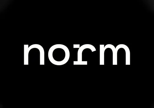
Minimal type specimen setting the word 'norm' in a geometric sans-serif with tight letterspacing and high contrast white text on black ground.
Summary
A minimal typographic study of the word "norm" set in geometric sans-serif with uniform stroke weight, rendered in pure white on a solid black field.
Visual description
Pure black background with white geometric sans-serif typeface displaying the word "norm" (lowercase) centered and occupying roughly 60% of the composition's width. The typeface features consistent, clean letterforms with generous spacing between characters, suggesting a modern, humanist geometric family. No serifs, no decoration, no texture. The weight appears medium to bold, with circular O counters and uniform line thickness throughout. Crisp anti-aliasing and perfectly legible at any scale. The composition emphasizes the negative space relationship between type and background, creating a high-contrast visual impact suitable for wordmark or brand identity usage.
Key takeaway
Pure typographic clarity through high contrast and generous negative space. The uniform geometric sans and tight-but-readable letterspacing create sophistication without ornament. This approach demonstrates how a single word can function as a complete brand mark through typography alone.
Reuse notes
A reference for tech, luxury, and editorial brands pursuing extreme minimalism. Works best when simplicity is the strategy, not the constraint. The black-and-white palette is production-ready for print, digital, and signage. Consider how it scales on small screens or large format applications, and ensure the typeface selection maintains legibility in context.
More like this




Keep what you find
A free account saves references to boards and can send you a weekly email of picks based on what you save.
To see every result, go Pro.